campaigns.


Massachusetts State Lottery: 50th Anniversary
Phase 1: The Logo
I remember as a child not understanding why such a fun looking game was for adults only. These magical tickets were so bright and colorful and would give ME money? The stuff I can buy Peanut M&Ms with? Are you joking? What could go wrong?
50 years later the Massachusetts Lottery has proven that the house always wins, though when it wins it does in fact give back to the community through various programs so why not celebrate the losers of the last half century? How does the Lottery celebrate itself and position itself to be more than just an addiction?
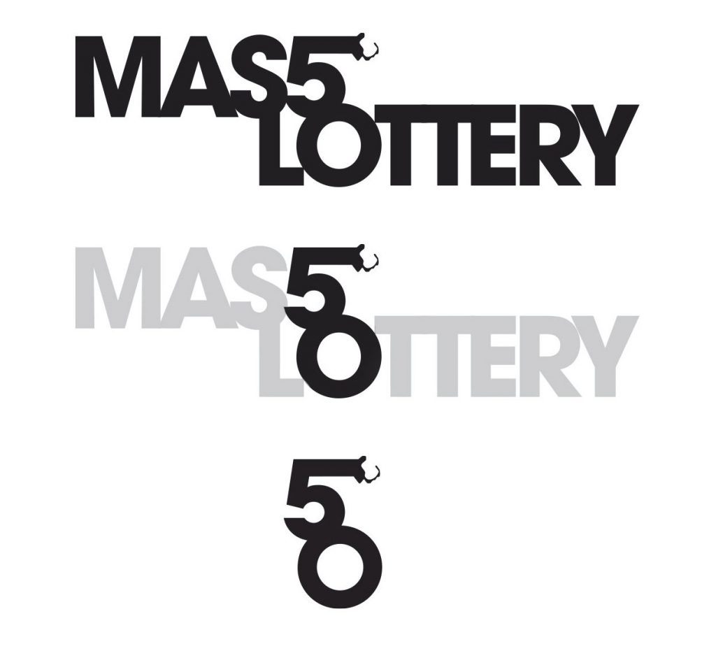
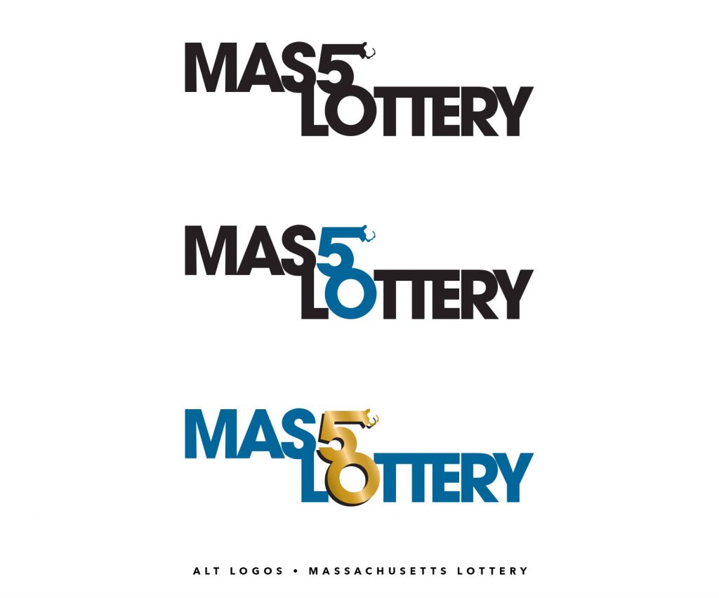
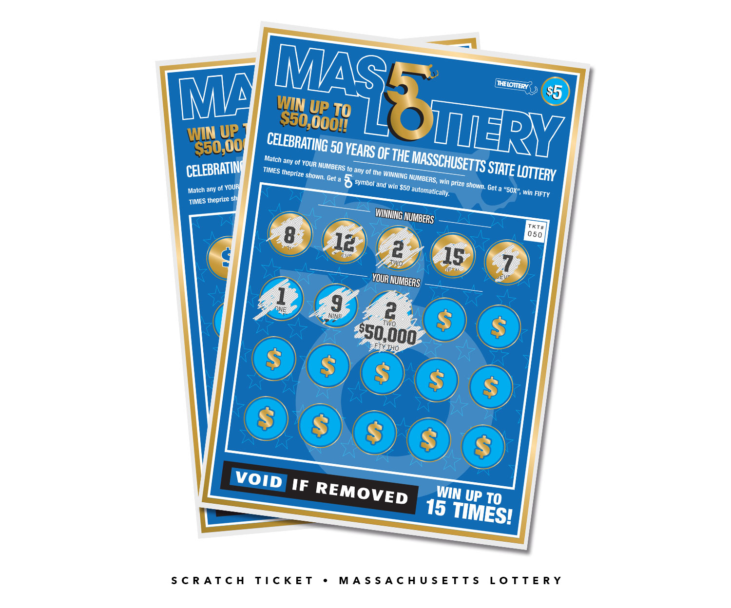
My Idea was to make a dynamic logo that could work as a standalone and also be placed in other text environments. I actually worked this one backwards. Beginning with the words “Mass Lottery” I stylized the S and O as a 5 and 0, subtracted the M-a-s-L-t-t-e-r-y, added the Massachusetts coast line from their standard mark and the 50 logo was born.
Phase 2: The Colors
From there I used the proprietary “Lottery Blue” and added black as a base neutral and gold representing the 50th anniversary. As all the colors complement each other they can be used on their own or in concert with one another.
I also added “Years” underneath to tie it together and open some other color opportunities.

Phase 3: The Alternative (original)
I thought the lock up of the original Mass Lottery was too valuable to discard so I kept it on as an alternative logo for any applications that called for it.
Phase 4: The Applications
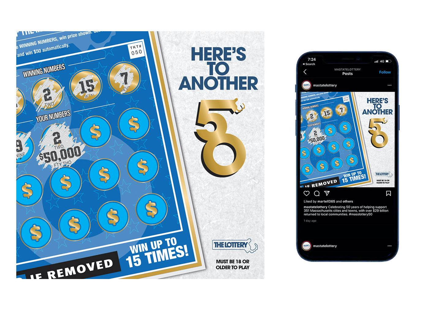
I added the tagline “Here’s to Another 50” and showed a scratch ticket with a winning $50,000 prize. This served as as a play on words, as in “Here’s to another 50 years” or – more importantly – to the scratcher, “Here’s to another $50,000 winner.”
Below are the scratch ticket itself, designed from … “scratch”, and the applications across the Mass Lottery website and social media posts.

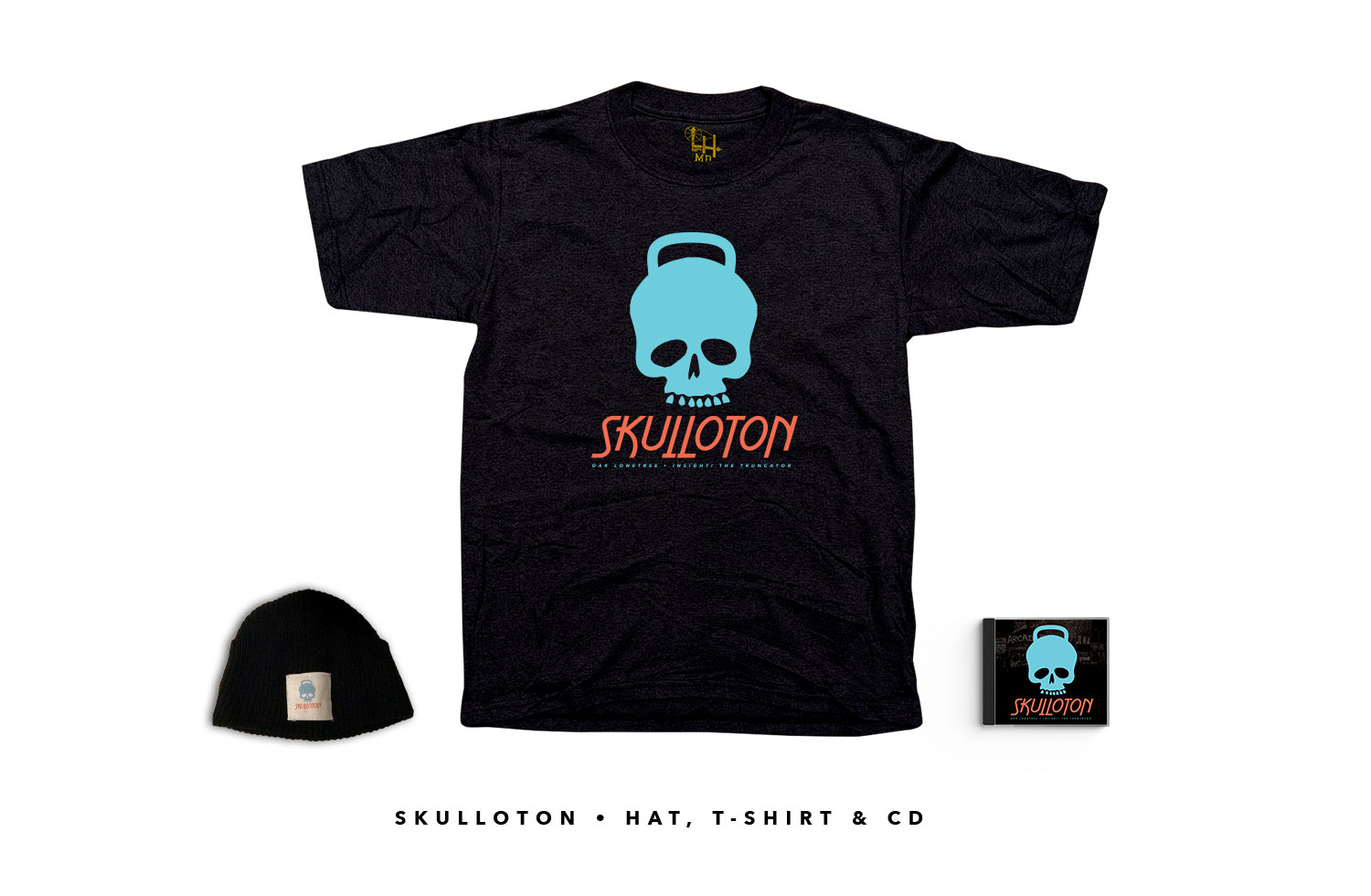
Skulloton Album
This album had a name, incredible beats by a producer and all around genius – Insight the Truncator, and lyrics by Boston hip hop veteran Oak Lonetree. Oak and I had worked together for years. He was one of the original members of my record label Cursed Out Productions. I produced or oversaw many of his earlier efforts in the mid to late 2000s. Some of our efforts were pretty cohesive, some we just felt the pressure of the early days “content, content, content” and would set release dates before the album audio was even mixed or the artwork was even started. Skullton was not an example of the latter.
Phase 1: The Logo
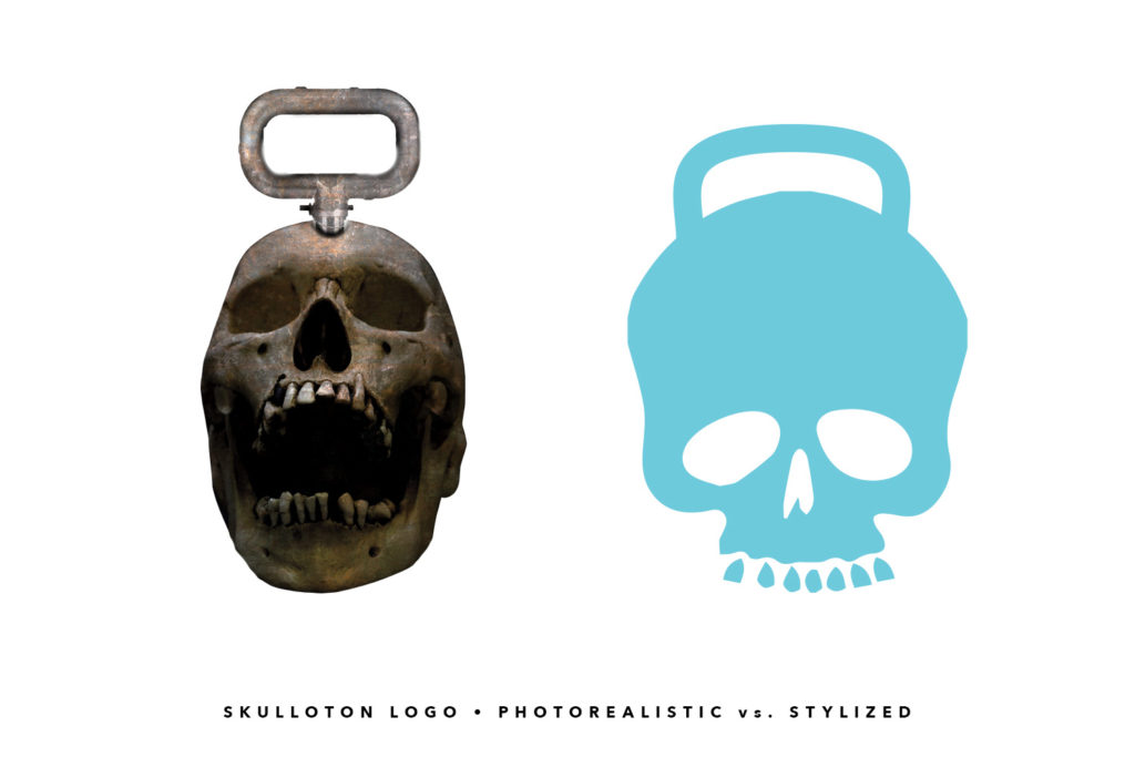
What the hell is a Skulloton anyway? We ran in the direction of a skull that weighs a ton, perhaps a braggadocios metaphor for being more intelligent than one’s peers in the “rap game.” Sure, why not?
We originally were thinking that a photorealistic album cover would do the trick. It’s just how we always did things. Until now. After completing the entire album cover, front and back, with the photorealistic horror movie kettle bell, I decided that maybe we would be better suited with a true mark, a logo that represented the feel of the album but could also be an icon, used across any medium.
Enter Skulloton 2.0:
Phase 2: The Singles
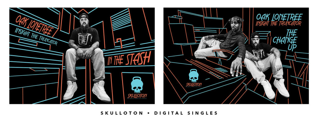
We decided on two singles to release before the album dropped and we needed a visual aide, as no one is satisfied with just music these days. (The horror.)
Oak had a professional photographer at the studio a couple weeks beforehand, and had grabbed some good pics for the promotion. Originally we were thinking we would just use the black and white photos, throw the logo on the corner, add the name of the song and be done.
We had made the decision for the color scheme for all collateral to be the sky blue and the peach/orange combination, so I decided to do some mixed photography and illustration compositions relating to the environment of each photo. Listen to: In The Stash and The Change Up.
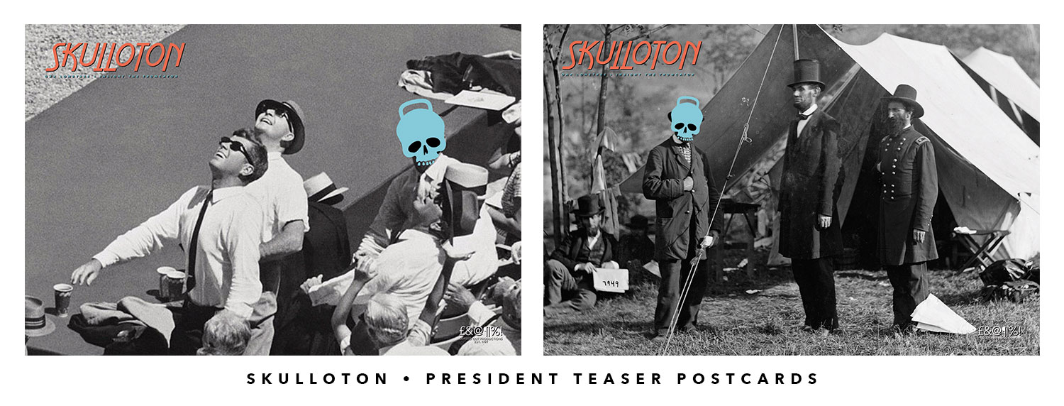
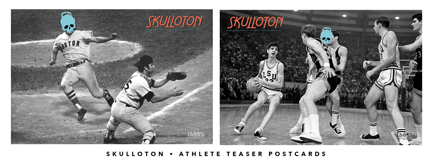
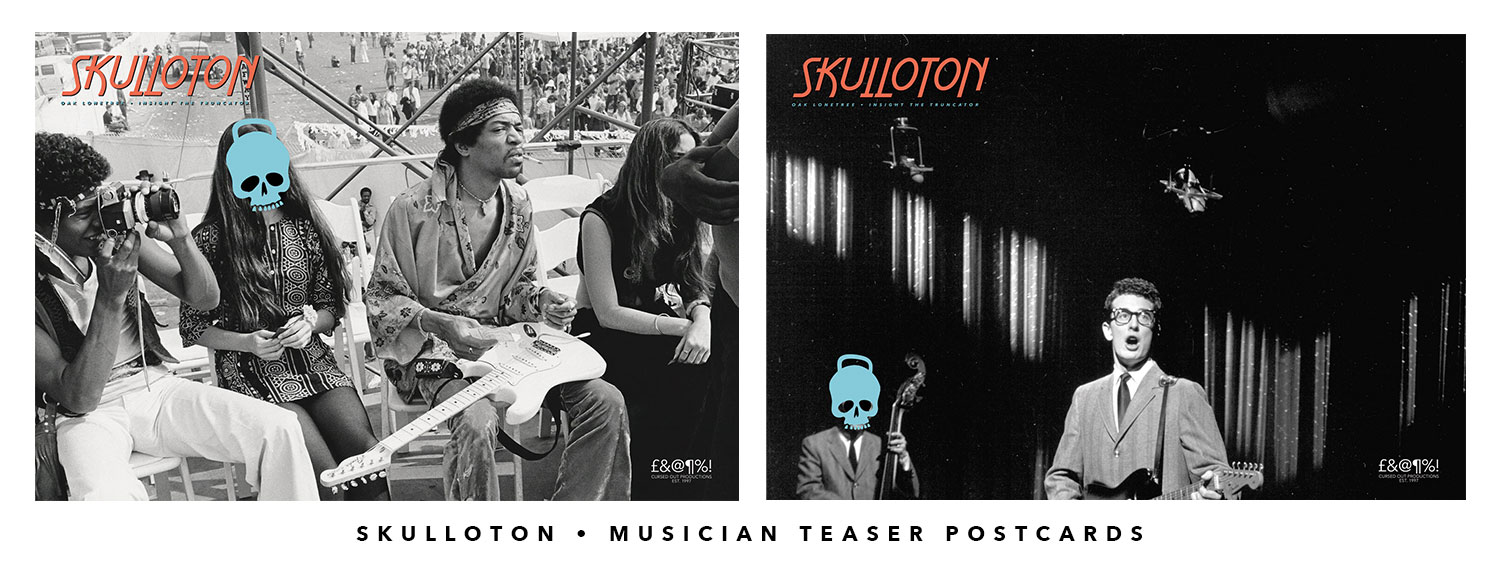
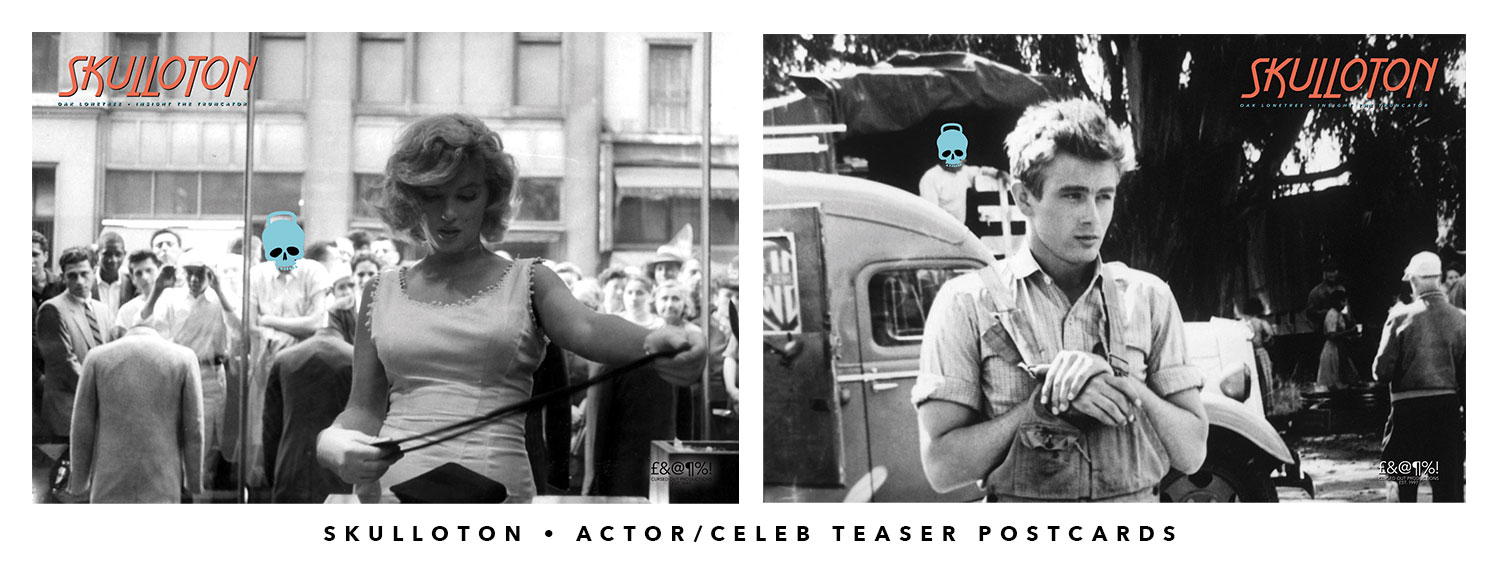
Phase 3: The Mysterious Pre-Release Promo “Postcards”
The album was about a month out from the first single, and I decided to throw it even further into the realm of mystery by making post cards featuring some of history’s most tragic and beloved figures. These featured images not often seen in the history books or the documentaries, to add to the visual interest and to make the viewer work through what was going on. Eight days out, we released one per day featuring presidents, musicians, athletes, and actors.
Each scene features the Skulloton mark, hastily covering the face of a relatively insignificant, yet lurking bystander, bringing some of the focal attention away from the subject and making the viewer work for the payoff. Was it a curse? A government conspiracy? A feeling of impending doom? A rap album?
Phase 4: The Album Release:
We released digitally and on CD on October 18th 2019, had a live show with the shirts, the hats, the whole gamut. We also added one more video, shot and edited by yours truly, to support the album after the release because, you know, attention spans.

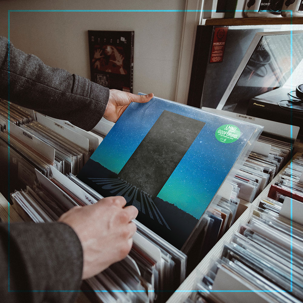
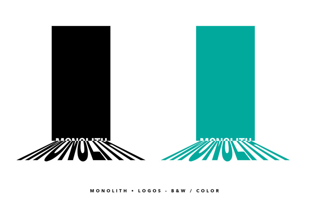
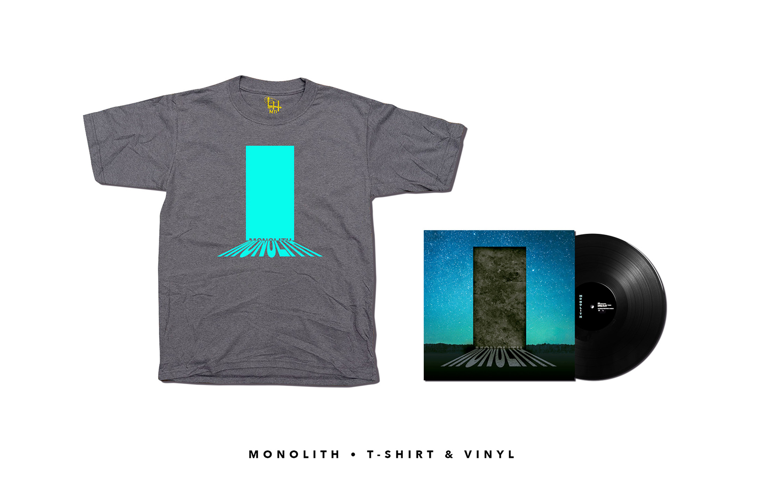
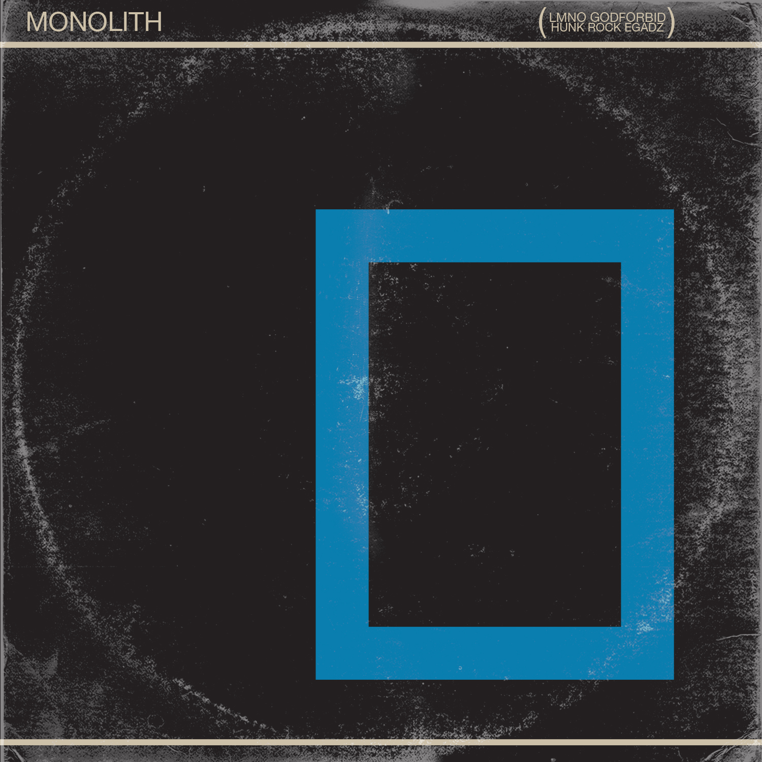
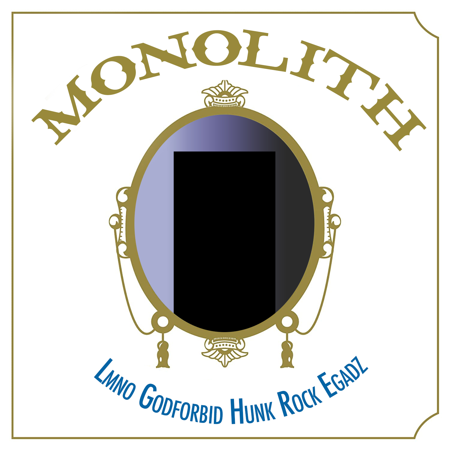
Monolith Record
The concept behind this album is what I am most proud of – a joint effort with my musical cohort who you may have seen on other pages, Nice Mike aka Hunk Rock. The idea for Monolith evolved rather quickly. We had a stockpile of beats which we had produced and gathered in about a week and the next step was getting them in the right hands.
We thought “Let’s send them to two people who have similar sized fanbases, many mutual collaborators, but have never and most like would have never worked together and have starkly different personas.”
Enter LMNO of The Visionaries from Long Beach, CA, a legendary rhythm-driven West Coast lyricist and Godforbid of That Handsome Devil, a loose screw in a loose cannon and maniacal master of the English language. Perfect.
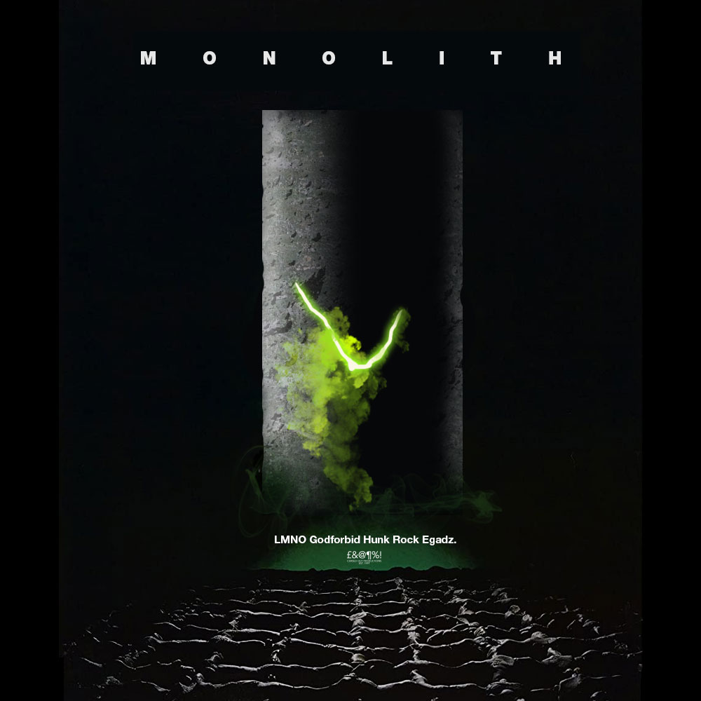
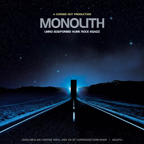
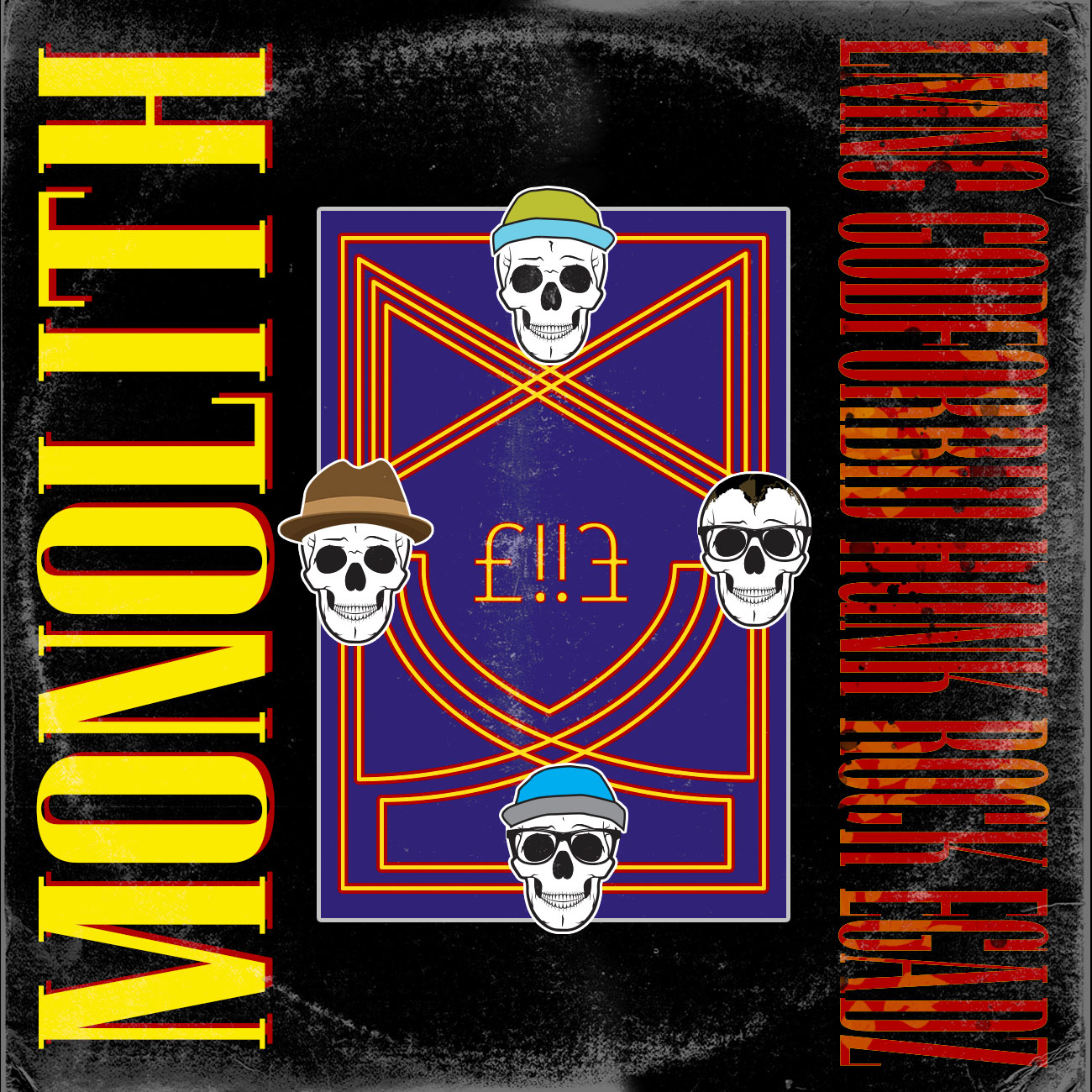
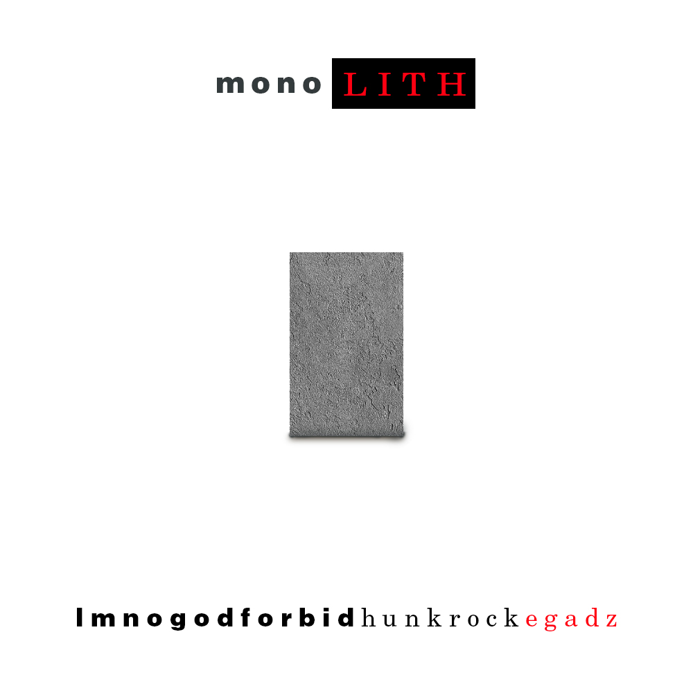
Phase 1: The Logo
First was getting the imagery to match the sound. As inspired as the album is by Arthur C. Clarke and Stanley Kubrick, I wanted more of a comic dystopia. Think Logan’s Run meets Ralph Bakshi’s Wizards. Simple forms, uneasy scale, dissonant angles.
Phase 2: Mysterious Promo Videos
This is the full set of what I termed “micro-trailers.” Much like the postcards from Skulloton, we released these every few days. They encapsulate the volatility of the music on the album, yet does not give one single second of music as a preview. This was the intention – starve the expectation.
Phase 3: Traditional Promo Posters & Listening Party
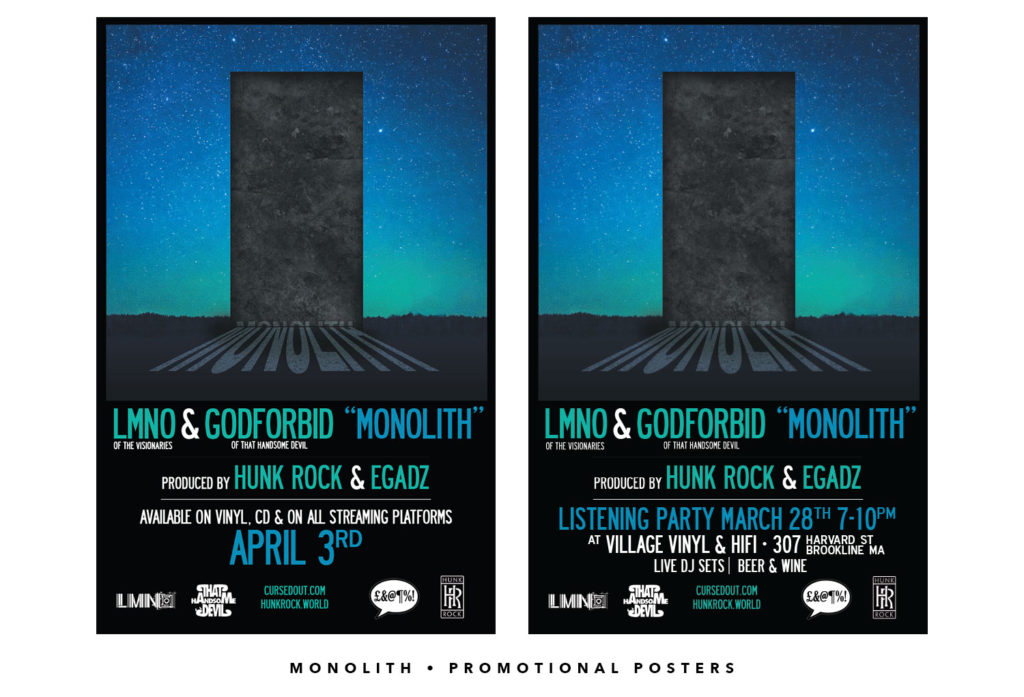
Phase 4: The Album Release
We did it. We made a vinyl record. Personally my first time and personally one of my favorite projects I have been a part of from start to finish. There were positives (gathering the people, making the beats, getting boxes of vinyl records delivered to the door) and major challenges (having to reject our first test presses because of a glitch and pay an additional fee to fix them, general financial concerns throughout) but nonetheless, I am proud of every single one of us. If you read this in time, go get your T-Shirts & Vinyl Monolith Deluxe package at cursedout.com.

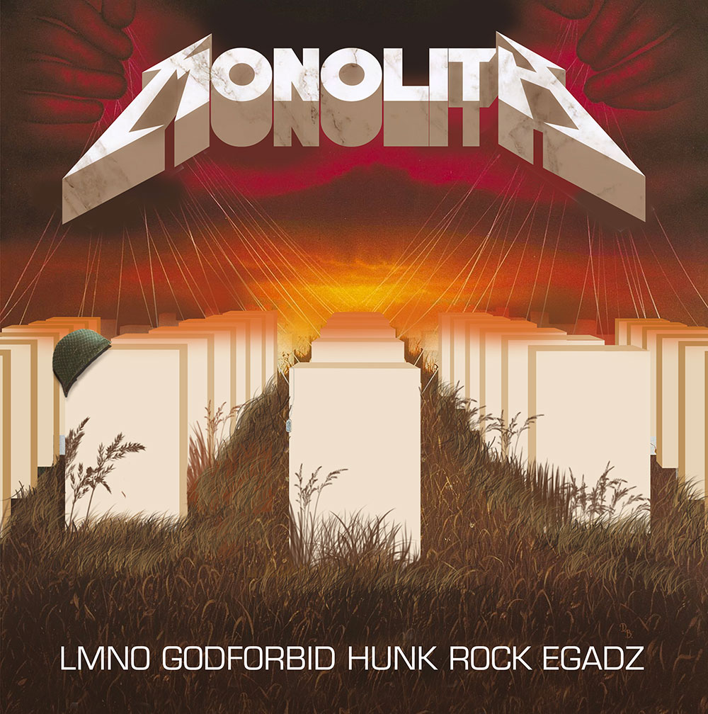
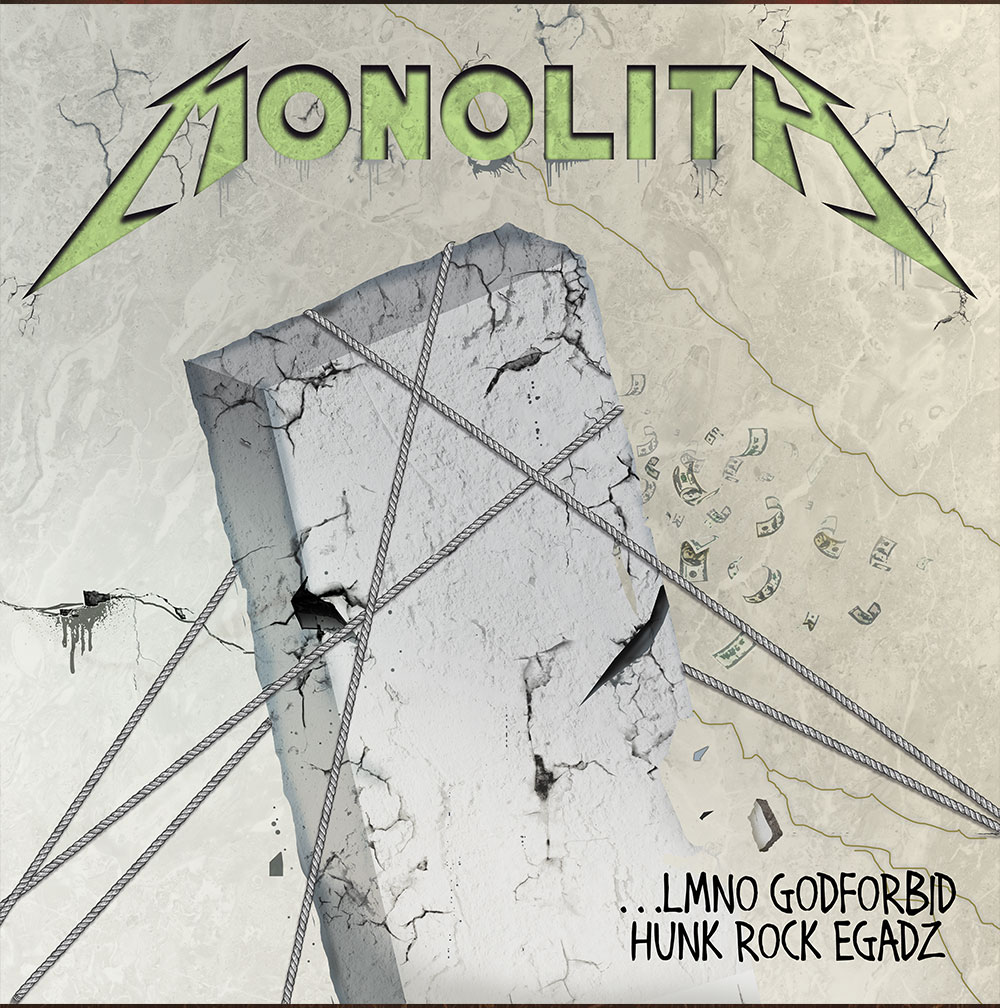
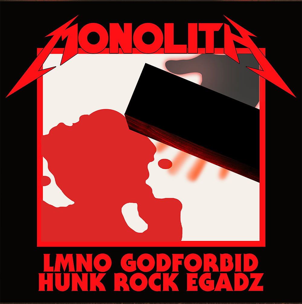
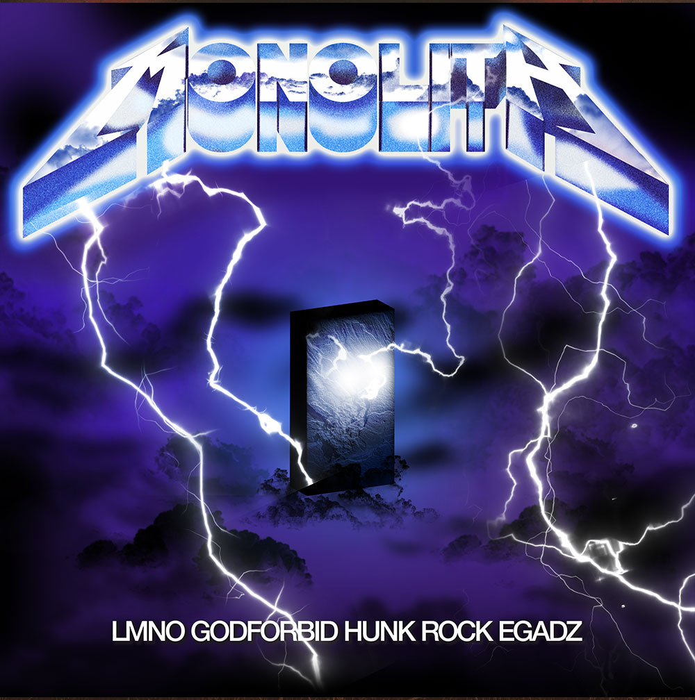
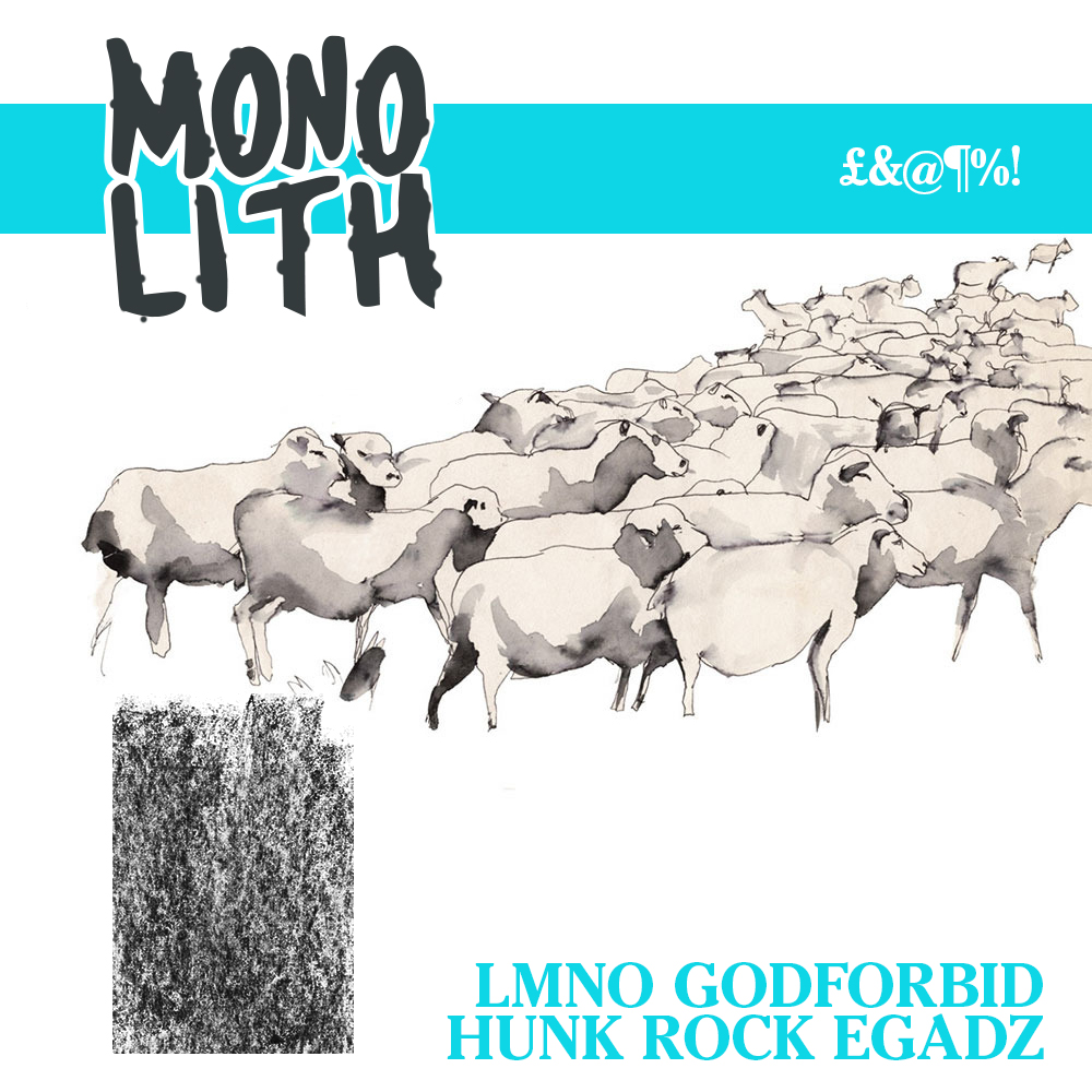
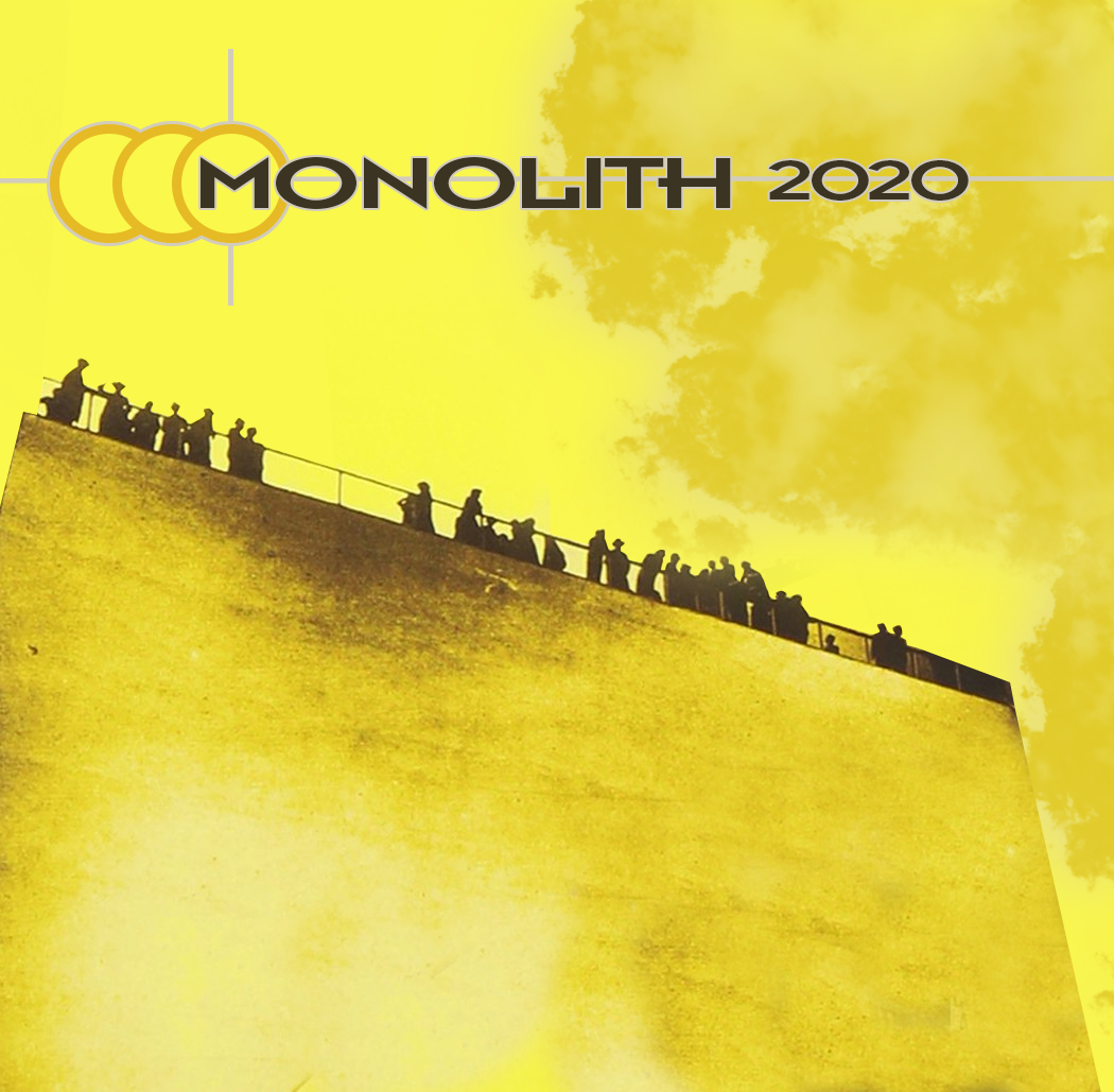
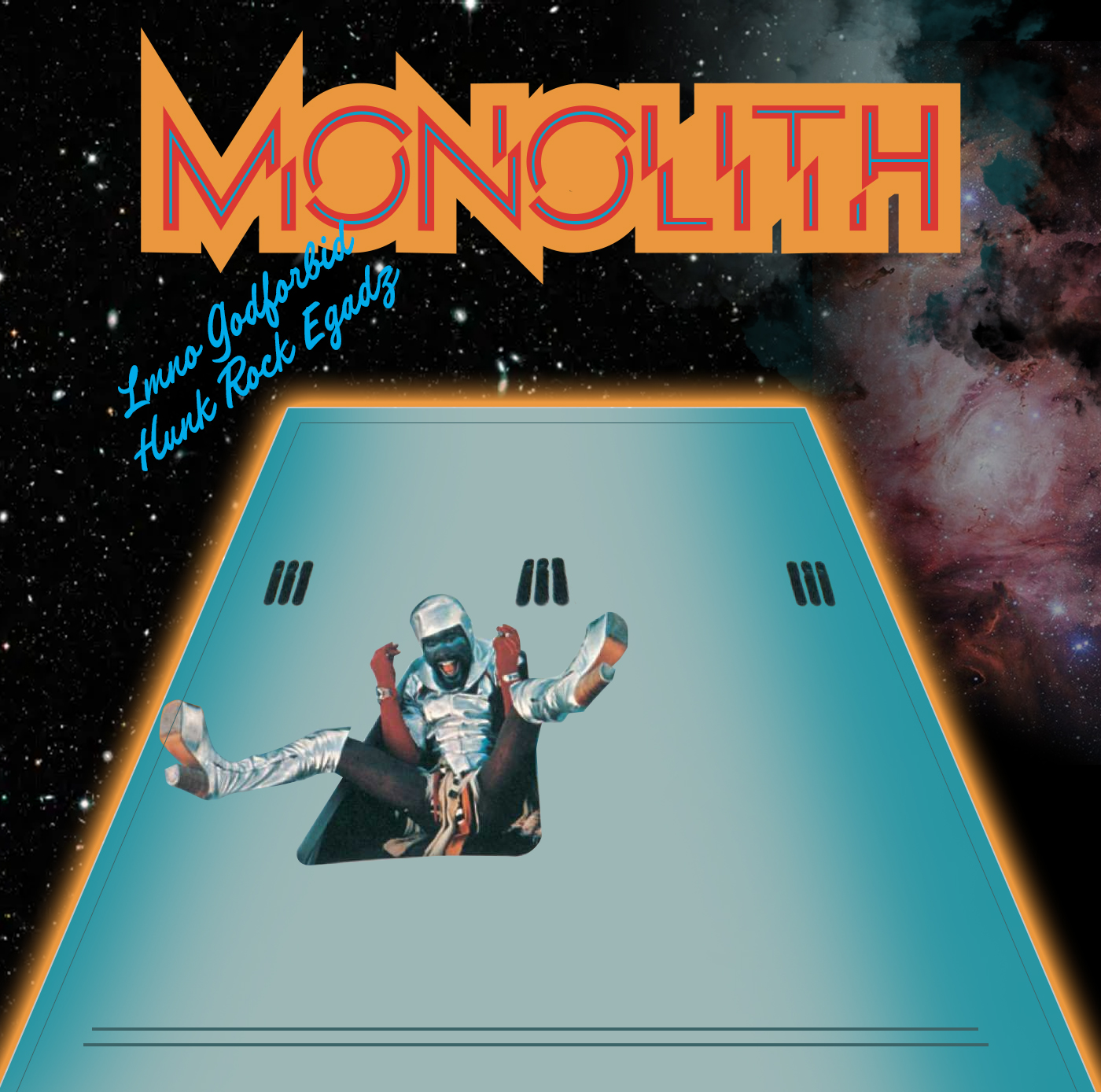
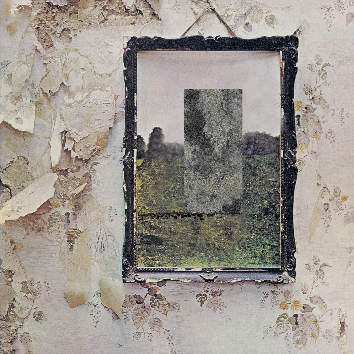
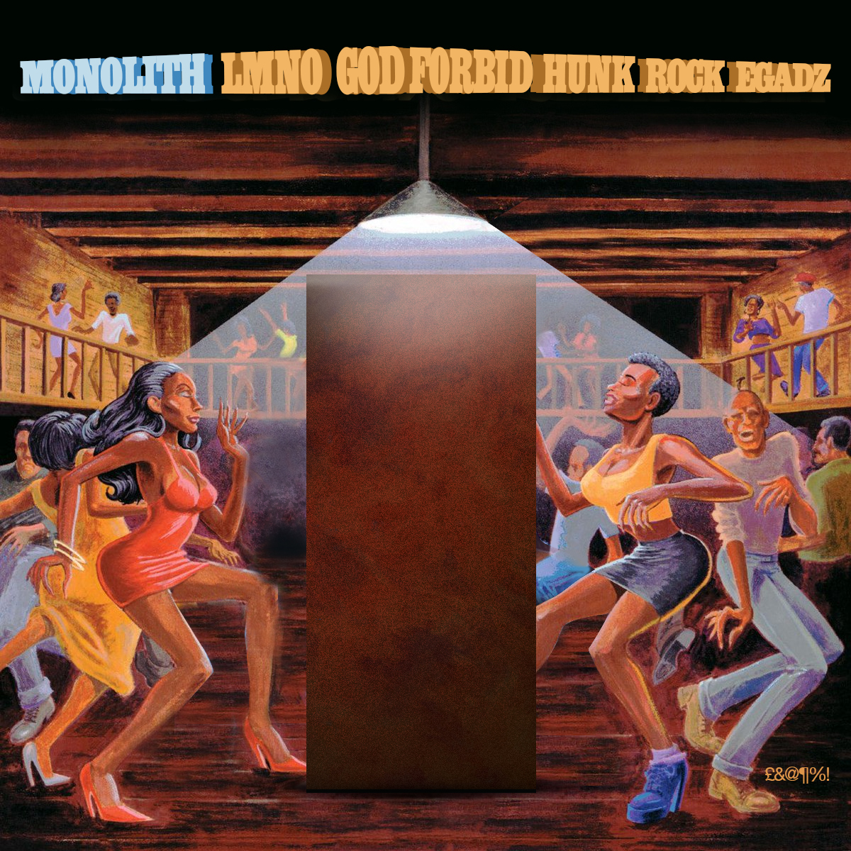
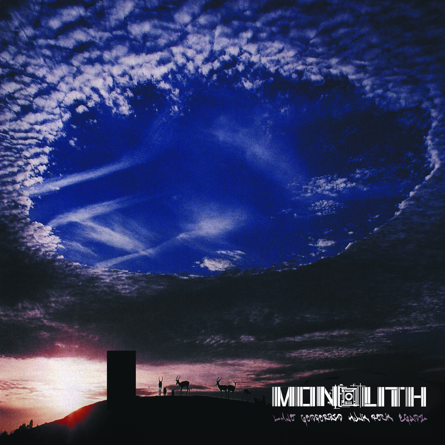
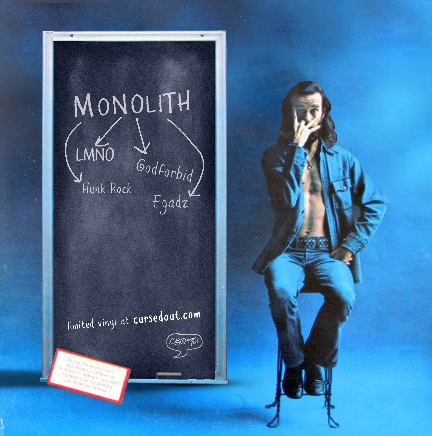
Phase 5: The Parody Covers
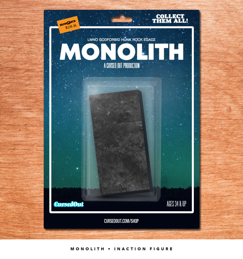
As I mentioned somewhere in here, I live for a good parody. Since the lockdown had just begun, why not make a thousand different album covers, ads, book covers and even an “action” figure for Monolith just to get people buzzing? And you know what? Worked like a charm. We did great numbers that day and it helped sell the record both physically and digitally. Enjoy the fruits of my labor with an assist to the original artists, of course. If you have any requests, you know where to find me.


The “Inaction Figure”
I don’t get to design packaging as much as I’d like, so when I can mock something up for fun, I will jump on it. With the renaissance of Star Wars and Marvel, action figures have made a notable comeback. This was obviously parodic as well. The original plan was to shoot an actual 1980s-style toy commercial with kids playing with a monolith in the yard and abandoning all of their actual good toys, but alas it was a tough year for planning and interacting. Hopefully soon.