font design.
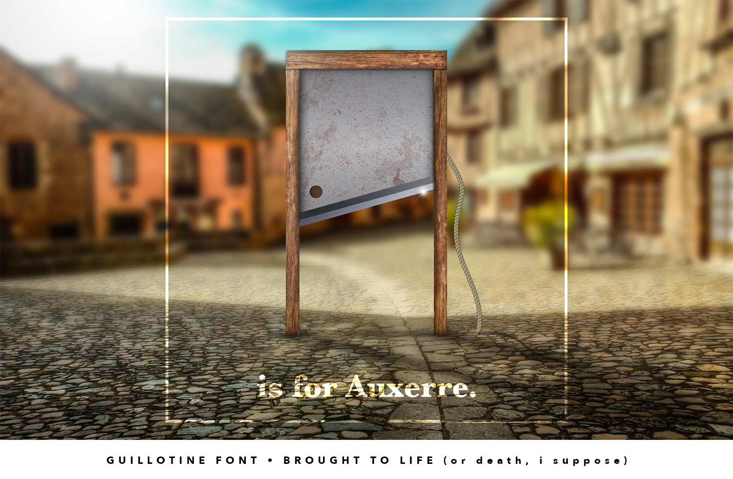
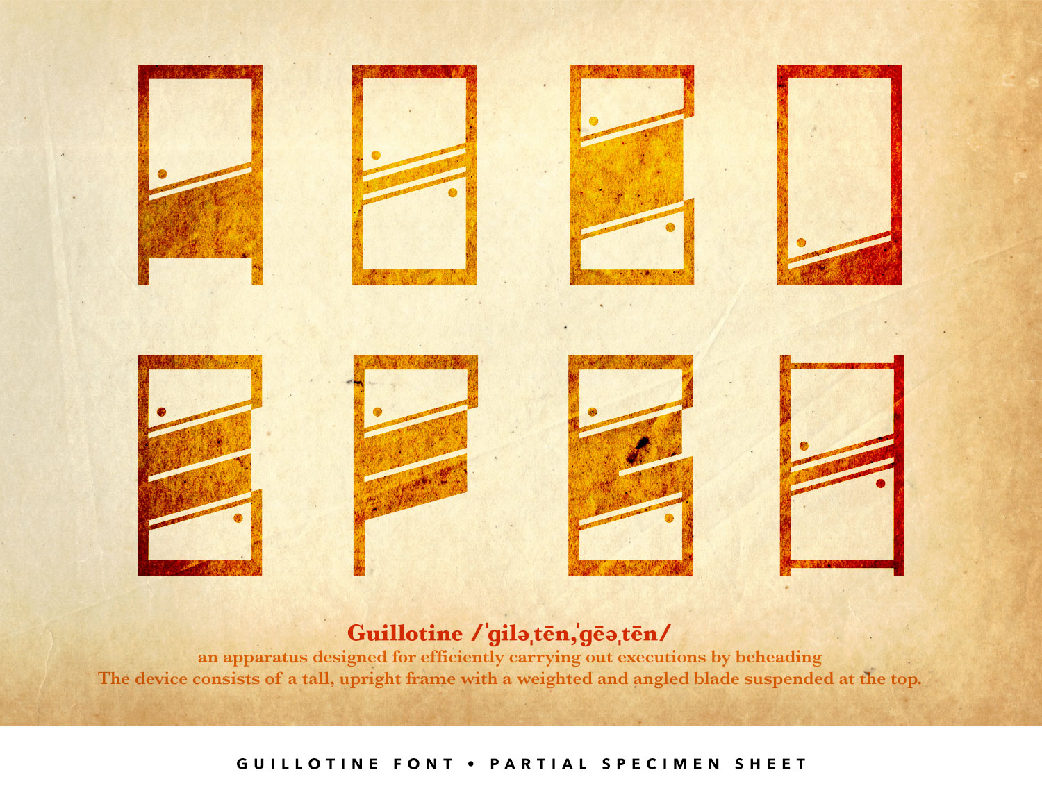
Guillotine (in progress)
There are times when I think of an object and decide to see if I can make letterforms from them. There are times when I'll begin with the potentially most difficult letter, And there are times I just start at "A" and see how far I can get. Im this case, the seemingly easy "I" was the stumbling block. Why would I put up an incomplete work, you ask? It's because the idea is solid, it looks cool, and I'm not afraid to say when something is difficult. More later...
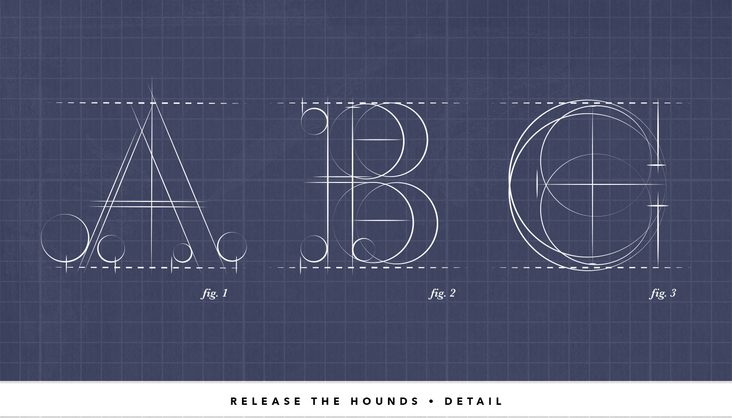
Release the Hounds
If you have already visited the Circle Cinema section on Illustration page, you'll see I enjoy either oversimplifying shapes within greater shapes or in this case, exaggerating the details of a form. Such is the case with Release the Hounds, a blueprint style derivative of Baskerville. With this I'm showing you the geometric "dark matter" around the form and how many lines and circles it takes to make a simple letter, especially a serif.
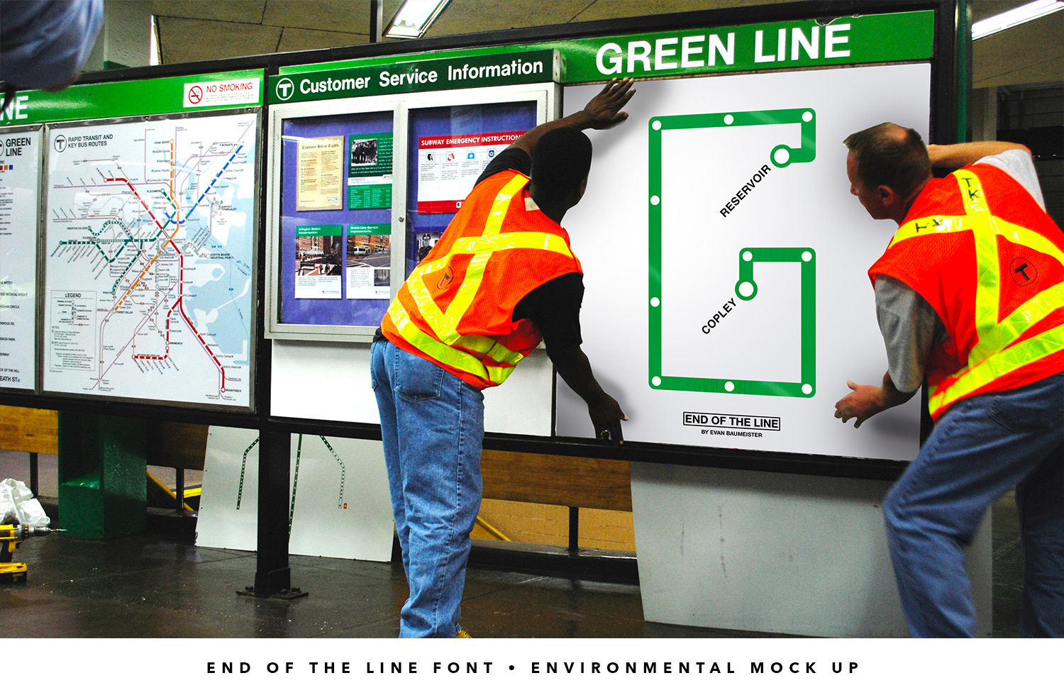
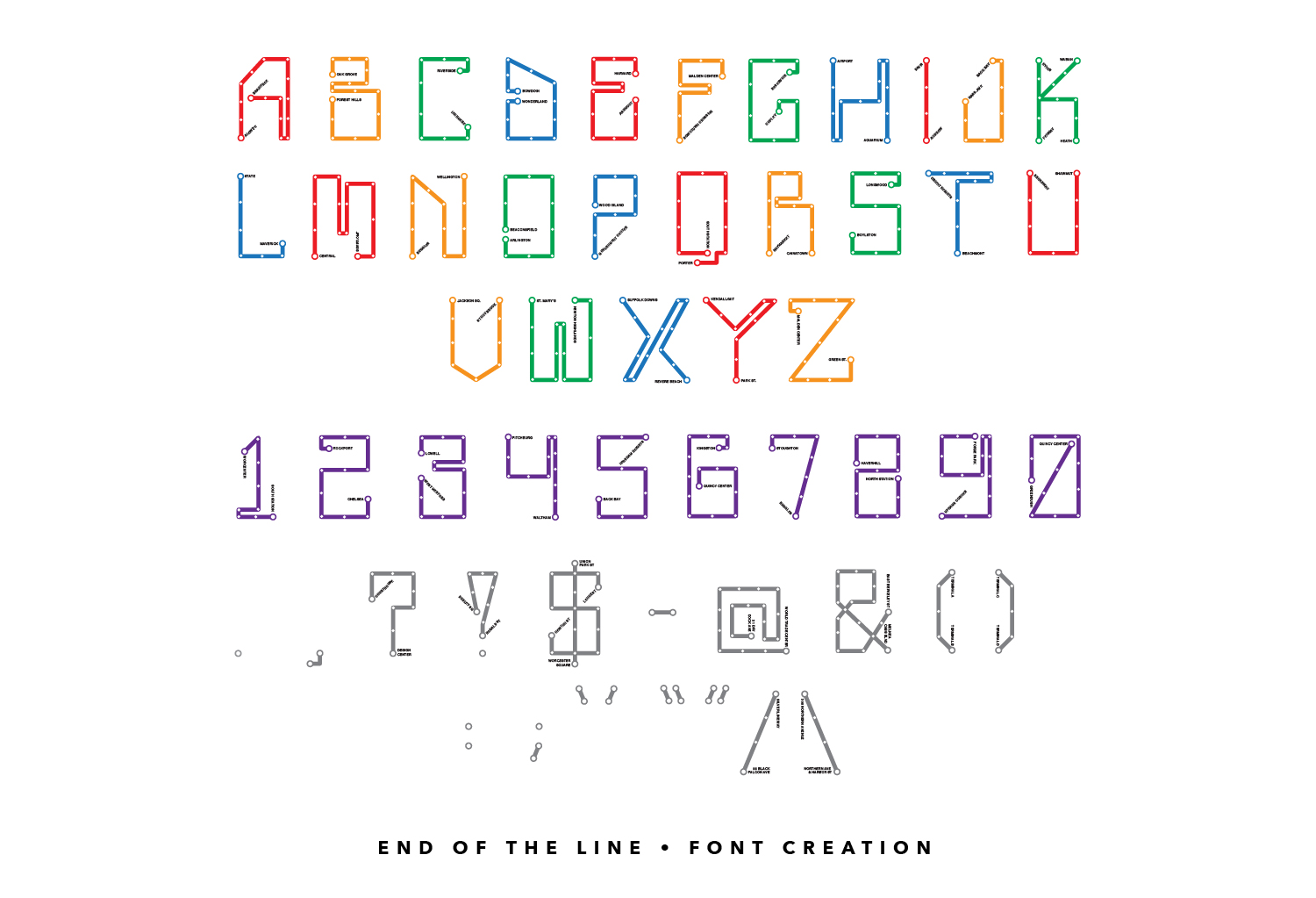
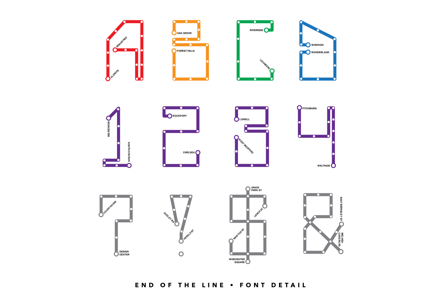
End of the Line
A side note about me: I love vintage streetcars. I even did a failed web series, touring the country riding heritage lines like Kenosha, Wisconsin and Boston's own Ashmont-Mattapan High Speed Line. The Travel Channel has not yet returned my calls.
I used to ride the MBTA into Copley on weekdays to go to preschool while my mom worked at the French Library in Back Bay. Another childhood experience playing a major role in my adult life. I may or may not be building a 1/87 replica of a section of the Green Line in my basement as we speak.
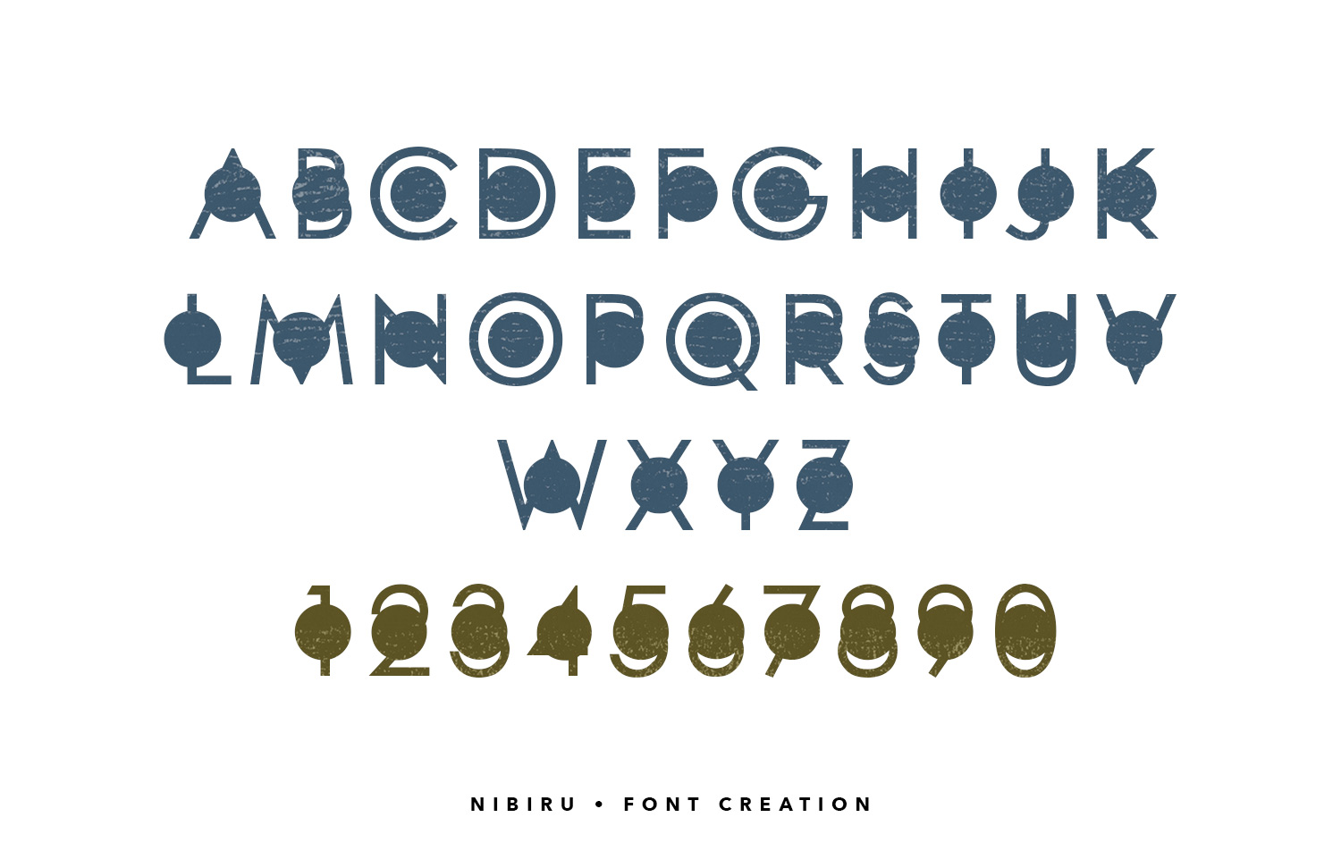
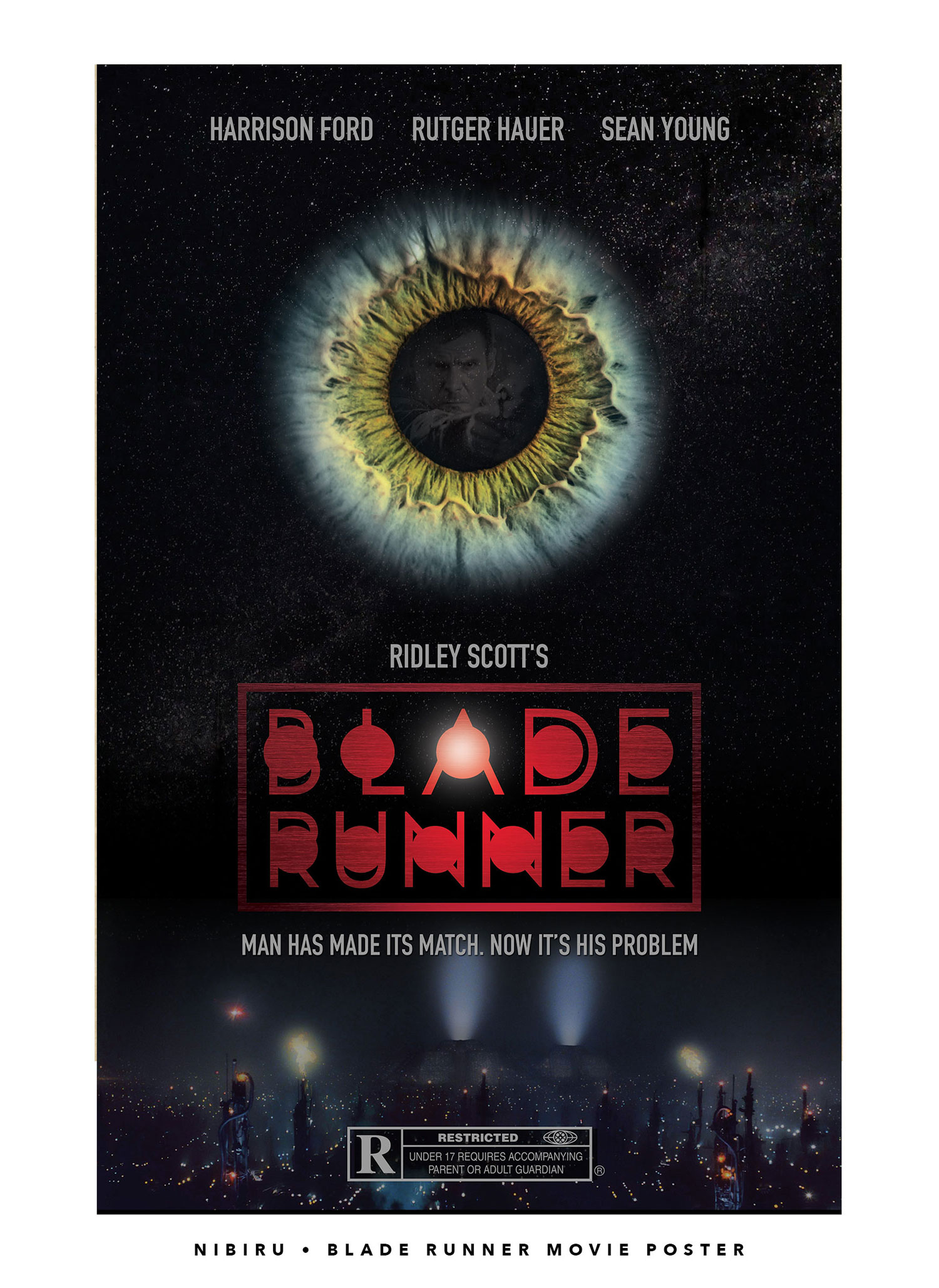
Nibiru
Remember when people said that Planet X aka Nibiru was going to crash into the Earth at the beginning of the Century? This is a fontographic™ representation of Planet X crashing into the Century Gothic.