in print.
Worlds Collide – A Mashup of Sight and Sound
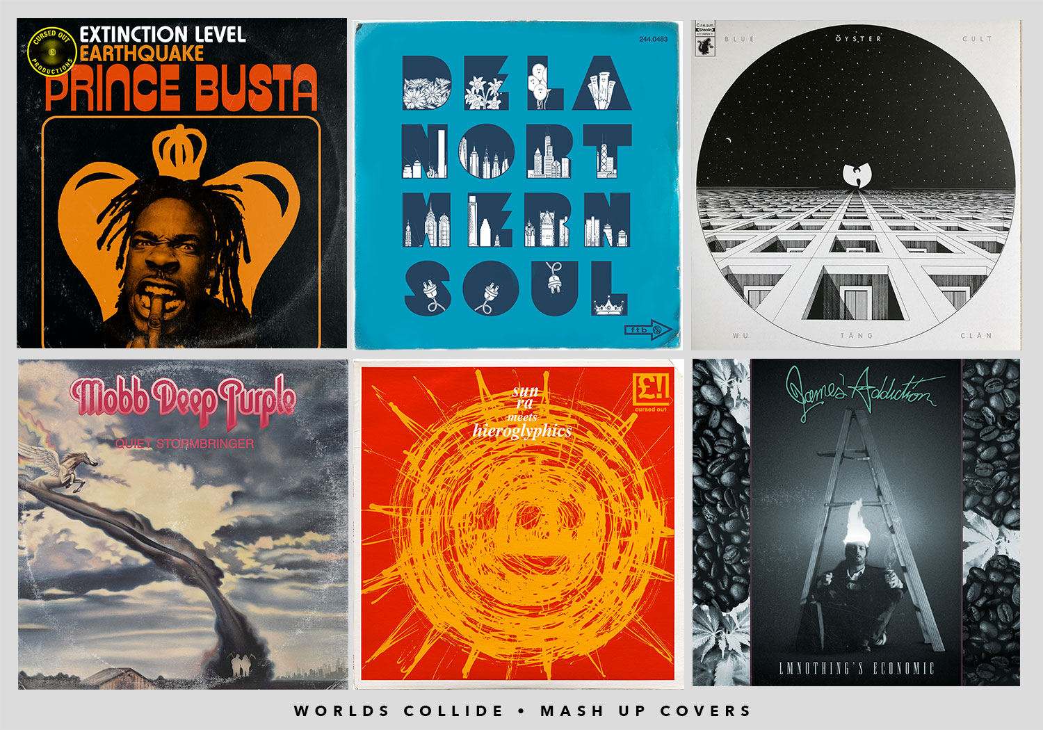
The concept of this book is to deliver unexpected pairings of musical artists that don’t belong together in any sense at first glance, yet when you dive deeper you can find similarities in style and influence. It began as just a book where I would essentially pick a pair out of a figurative hat, and make an album cover involving them. Be it a funny name coincidence, a shared city, or just a curious musical style, I found that I could pick artists on the edges of their respective spectrum and it could still work. “Ok so let’s make a book.”
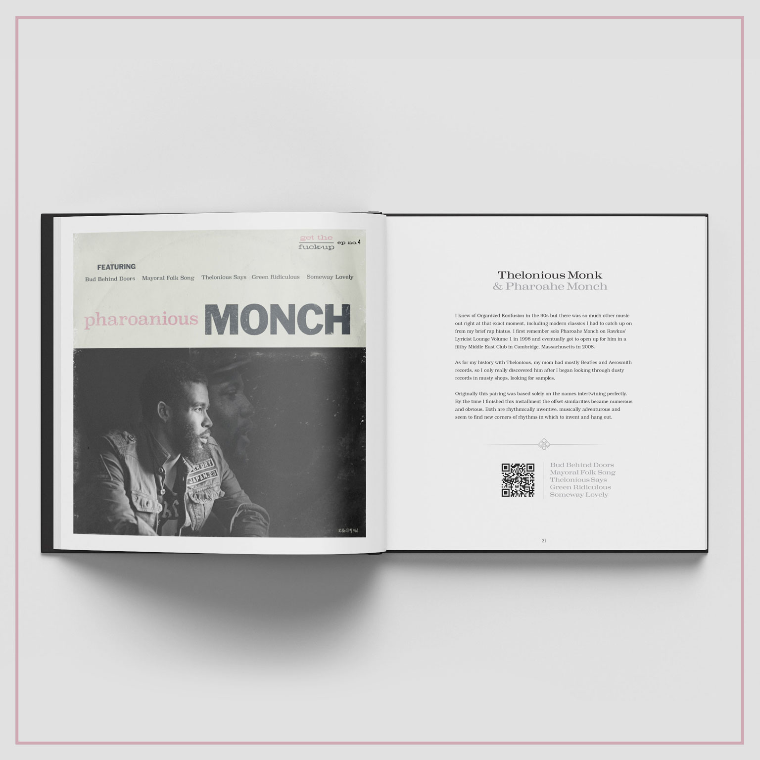
“Thelonious Monk and Pharaohe Monch. Pharoanious Monch.”
The names are similar, both have harsh, angular styles, and invented new corners of rhythm in which to live freely. The cover was done in the old Blue Note Style featuring the spirit of Monk visiting a pondering Monch.
To take things further, I decided that for each album cover, I was going to make a five song EP featuring the vocals of one artists over the music of the other. Another challenge.
After scouring catalogs upon catalogs I whittled it down to five songs from each and spent hours in the studio retrofitting these vocals of a fledgling art form over music from eccentric Jazz from 60 years ago.
Rinse and repeat until it’s 30 albums, 60 pages, and 150 songs.
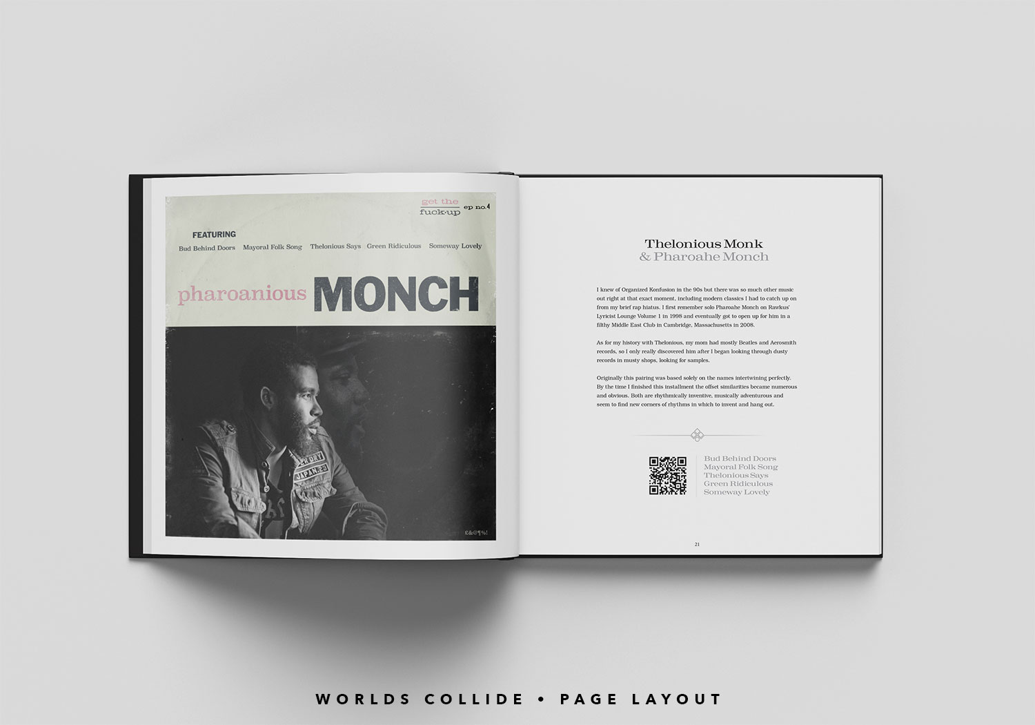
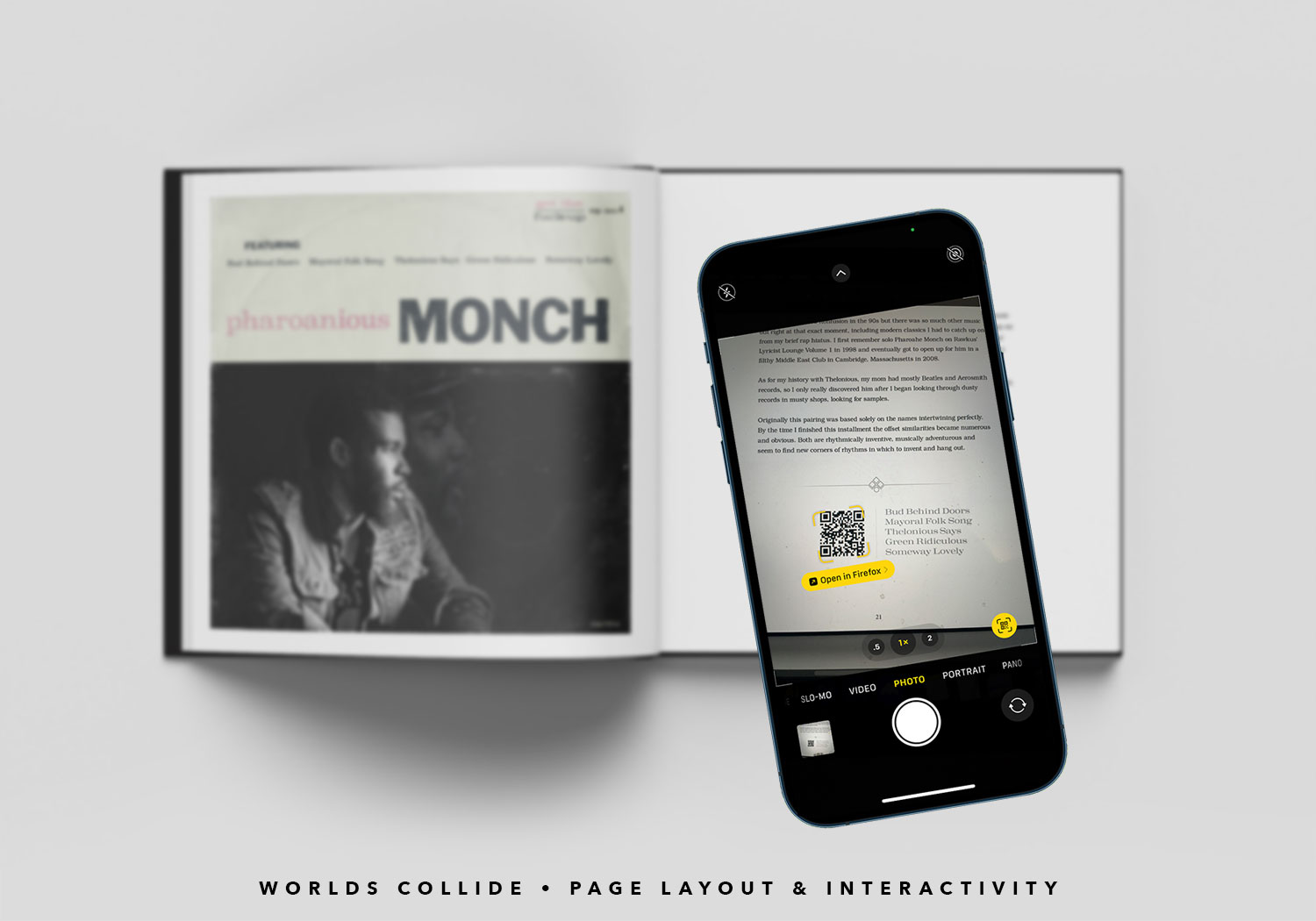
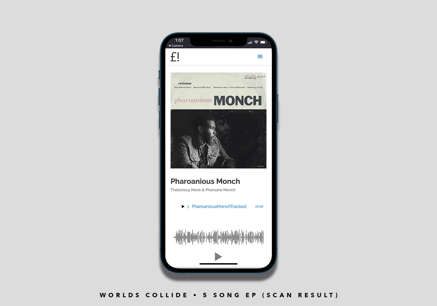
Pharoanious Monch “Bud Behind Doors” – A masterful mash up of Pharoahe Monch “Behind Closed Doors” and Thelonious Monk “In Walked Bud”
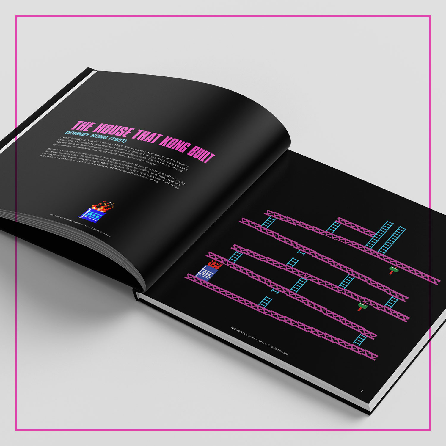
Nobody’s Home – Adventures in 8 Bit Architecture
I can’t pinpoint exactly when it happened but some time in the last ten years, experts across many fields have added a hint (or a heap) of arrogance and self importance to their explanations. Ask someone on the Apple support forum why the audio on your laptop won’t automatically switch from speakers to headphones and you’ll see what I mean. While I do think think the attitude is offputting and unnecessary, I also find it hilarious..
Where there is hilarity, there’s a project for me to do.
Video games have been part of my life since my father bought me a Colecovision console in the early 1980s. It was Atari’s main rival for a handful of years before Nintendo came along and changed everything. As much fun as it was controlling the hero and saving the world, I also loved the differen mazes, buildings and rooms that hero would navigate through.
Arrogant experts + 1980s video games = A coffee table book of formal critiques of 8 Bit Architecture.
Let the games begin.


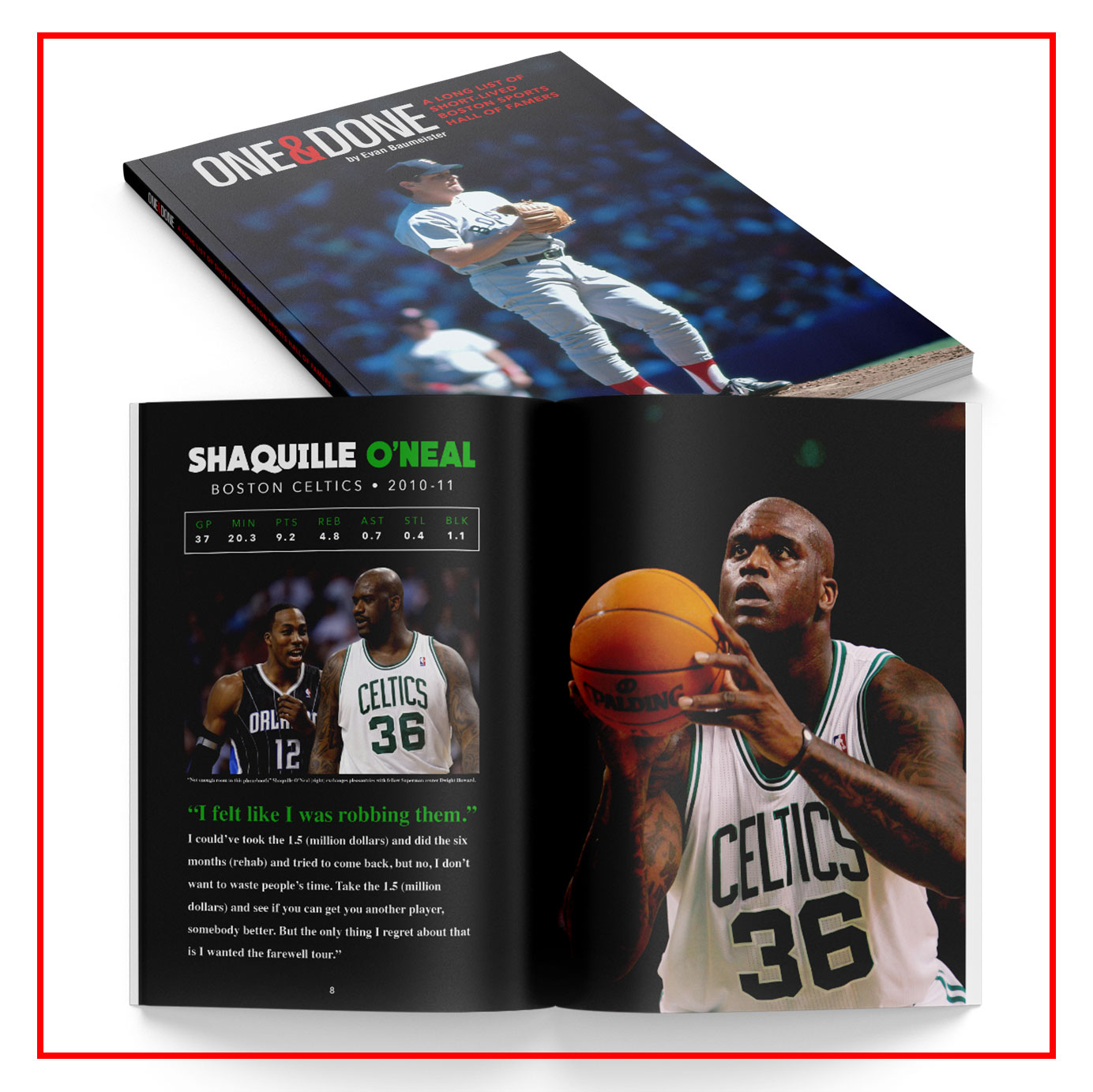
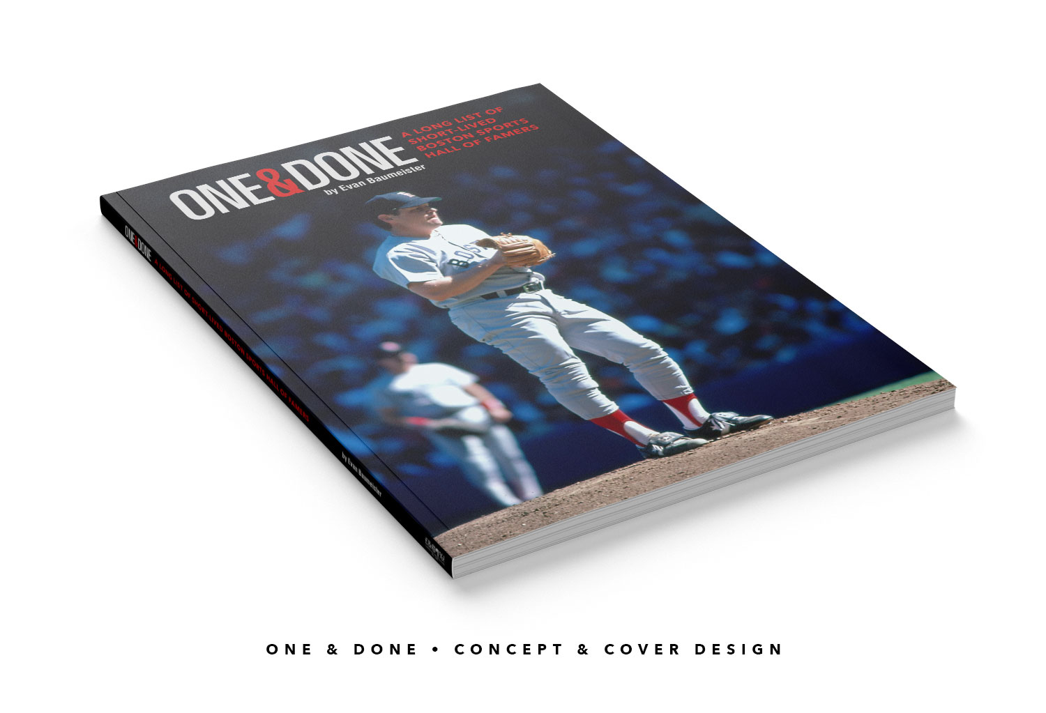
One & Done
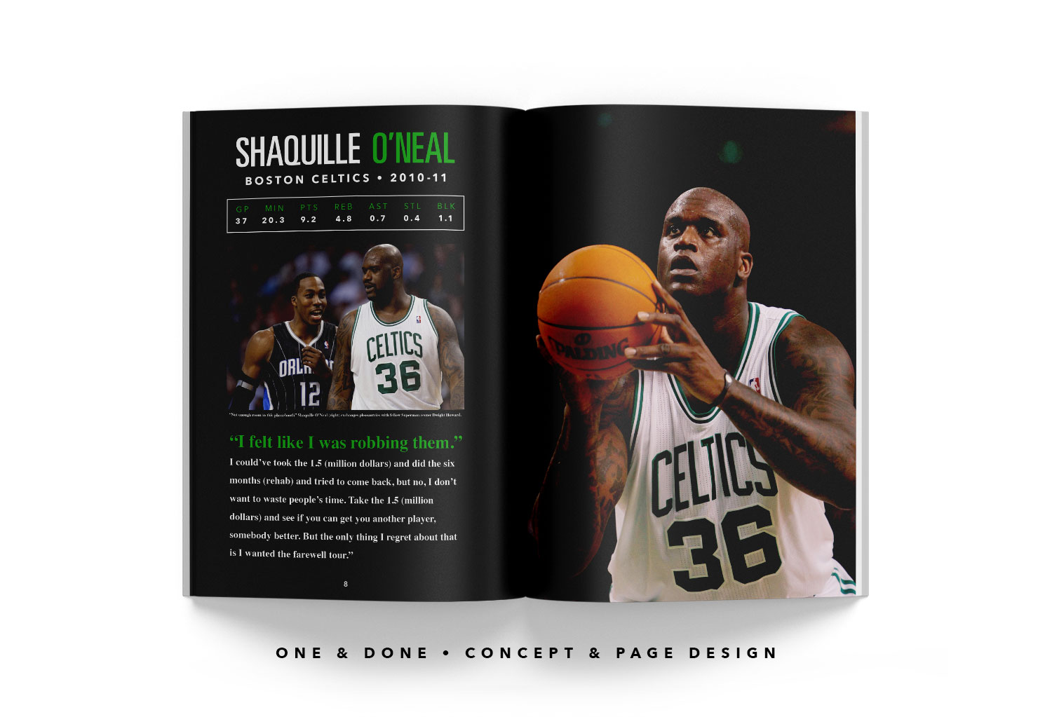
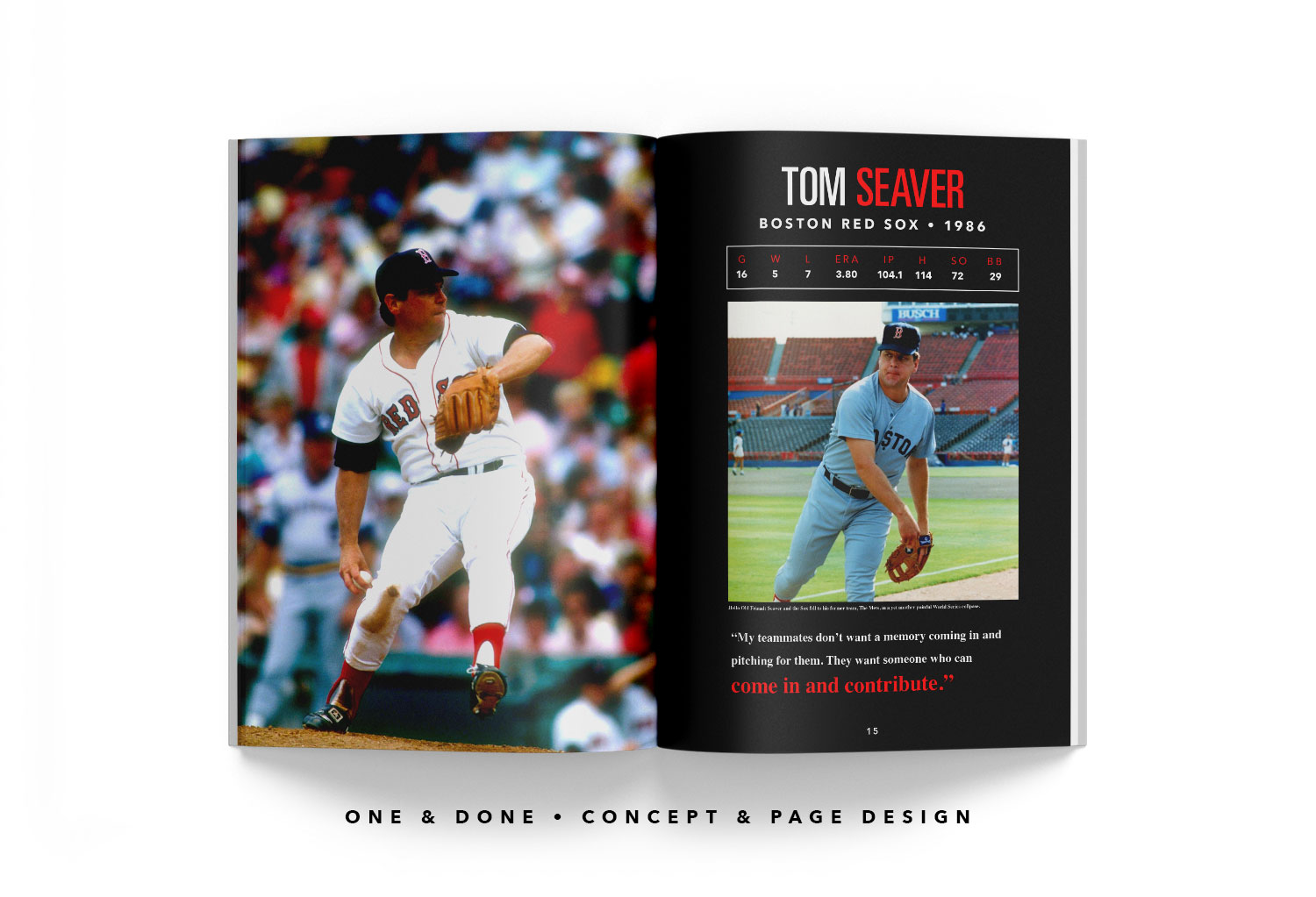
I am a sucker for obscure sports knowledge, especially surrounding my hometown of Boston. The idea began when NBA legend Shaquille O’Neal had a “cup of coffee” with the Boston Celtics in 2010 and subsequently retired. I then remembered that as a kid that baseball great Tom Seaver had come to the Red Sox for one year in 1986 and called it a career after literally limping to the finish line of Boston’s heartbreaking season culminating in a World Series loss to his former team, the New York Mets.
It turns out the one year rental wasn’t just a phenomenon in the era of free agency, super teams and chasing rings.
Baseball Hall of Famer “Happy” Jack Chesbro, a long time Pittsburgh Pirate and New York Highlander (Yankee) came back to his home state of Massachusetts to play one final game in 1909 against his former New York teammates. He took the loss which happened to be the final punctuation mark of his career.
From Dominique Wilkins just trying to find a home with the Celtics in 1994 before heading overseas to NHL Paul Coffey (below), ranking second all time in scoring for a defenseman (behind some guy named Bourque), showing that time is still undefeated before hanging up his skates one last time in the Bruins locker room, the phenomenon fascinates me.


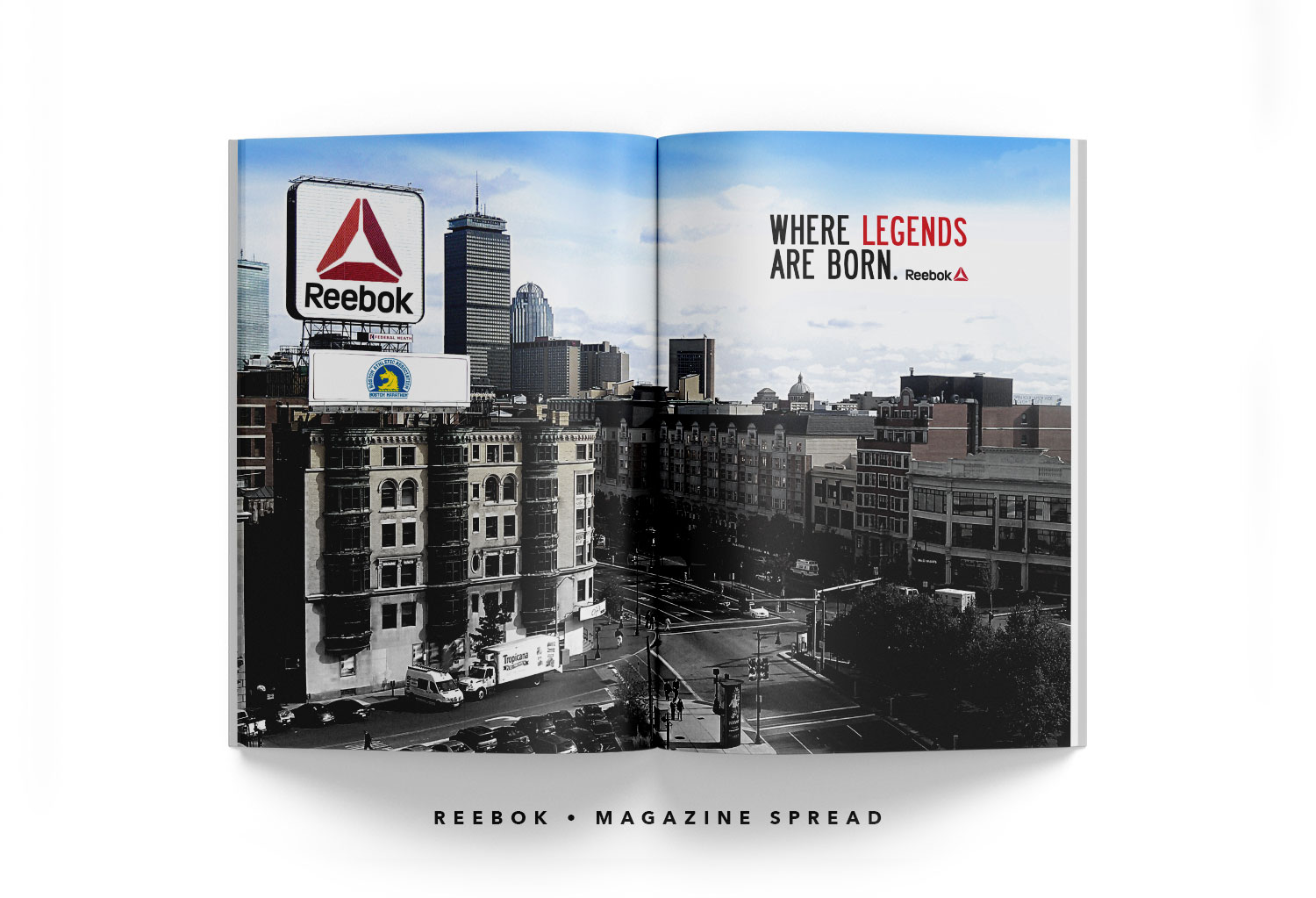
Reebok Magazine Ad
One way I like to accomplish this is taking the familiar and tweaking it just enough to make someone look again. On the spread below, I have taken an all too familiar Boston scene which heavily relates to both the Red Sox and the Marathon, and changed the iconic Citgo sign to fit into Boston-based Reebok’s narrative. The make up of both logos, shape, color and composition were opportunities I could not pass up.
Levi’s Magazine Ads
Another method is forcing fully irrelevant imagery to work to an advantage. In the case of these two Levi’s ads, the mandate was to target the 50-plus crowd with words and images that they could relate to in a “good old days” kind of fashion while getting a laugh and subconsciously getting them to think about an apparel classic. The 45 record adapter ad was required to be all visual.
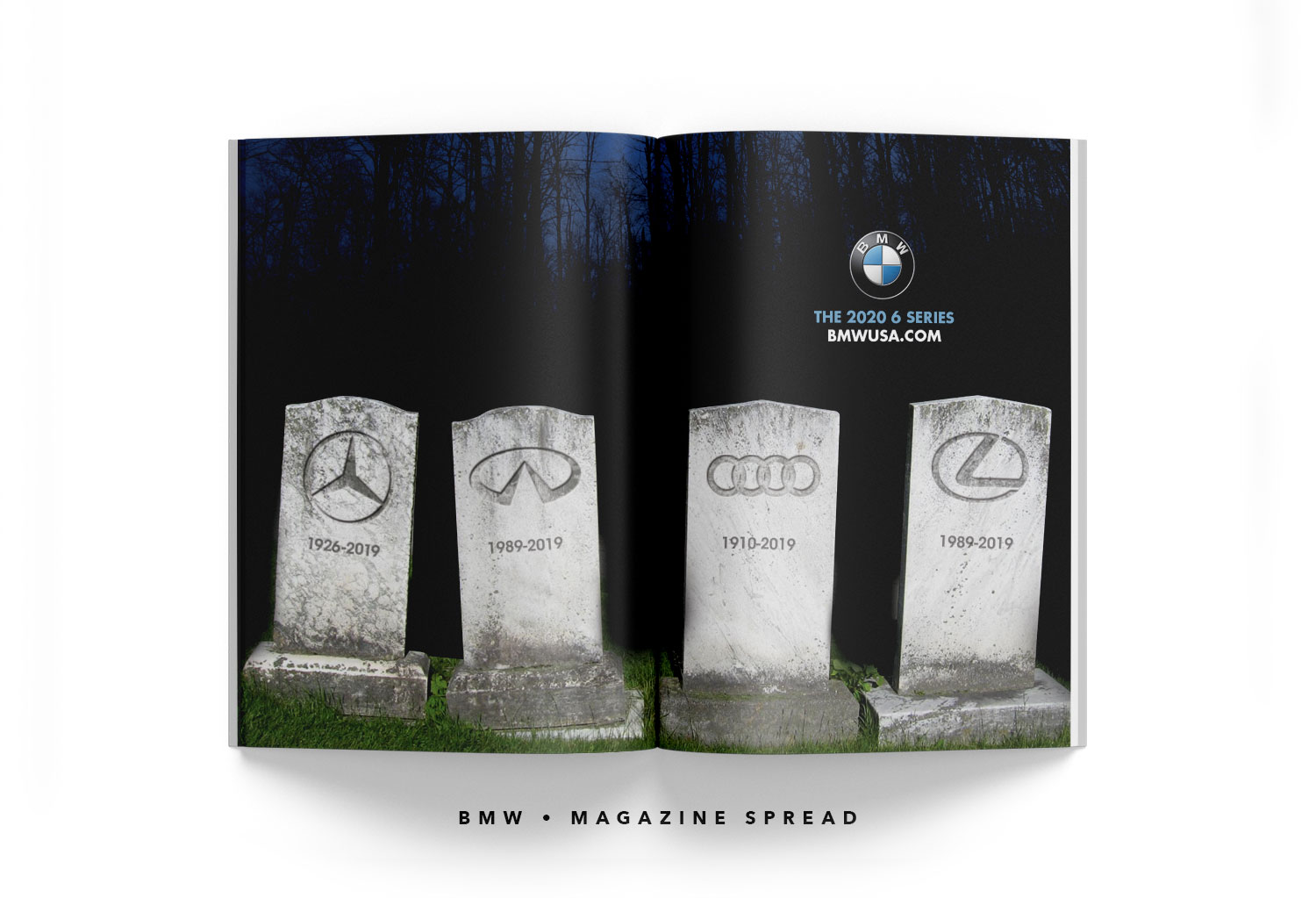
BMW Magazine Ad
Apologies to the competition. One of my favorite approaches is selling the product without showing it.