branding & rebranding.
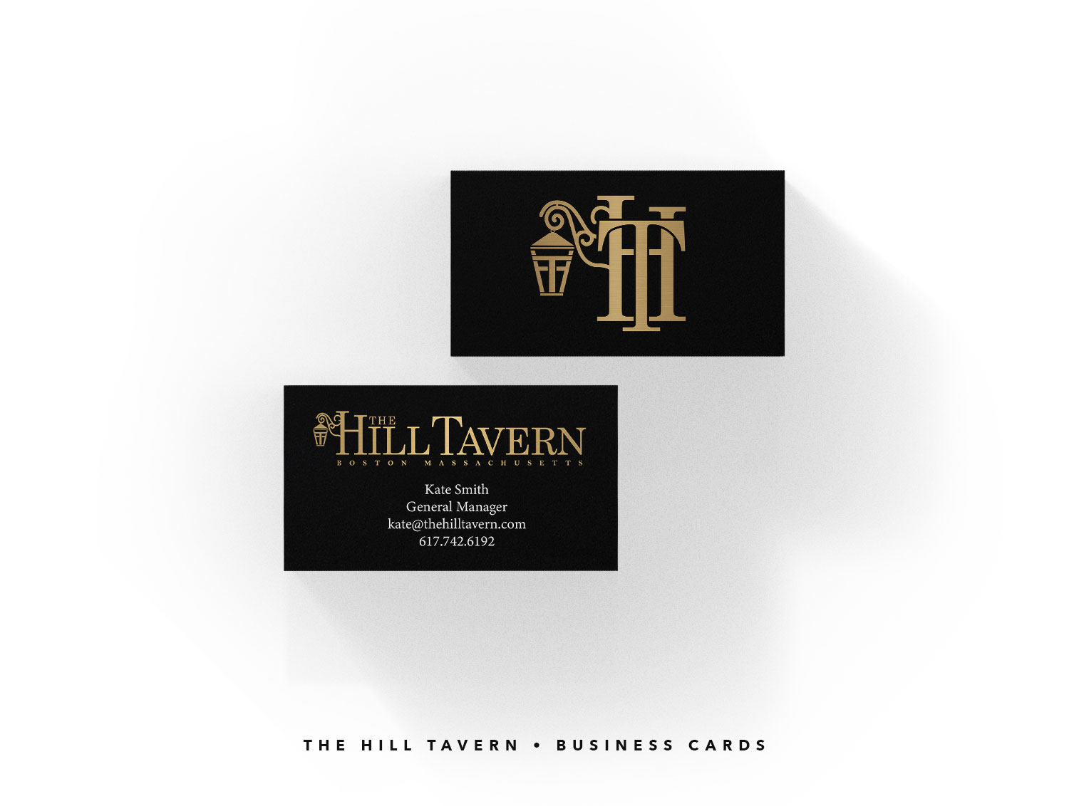
Rebranding • The Hill Tavern
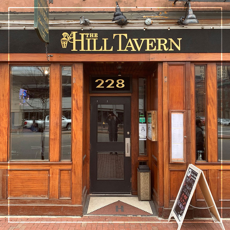
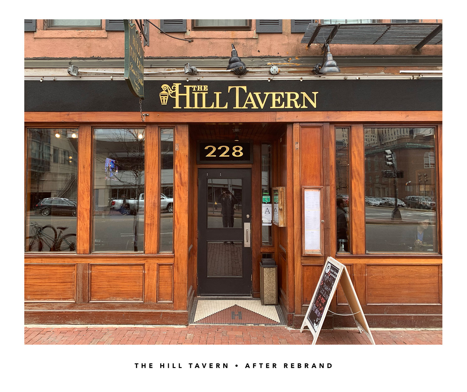
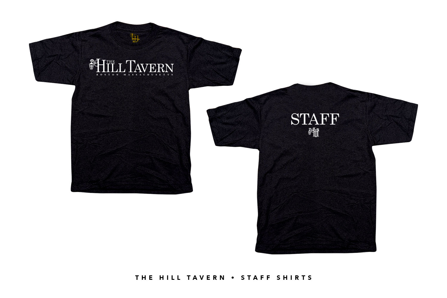
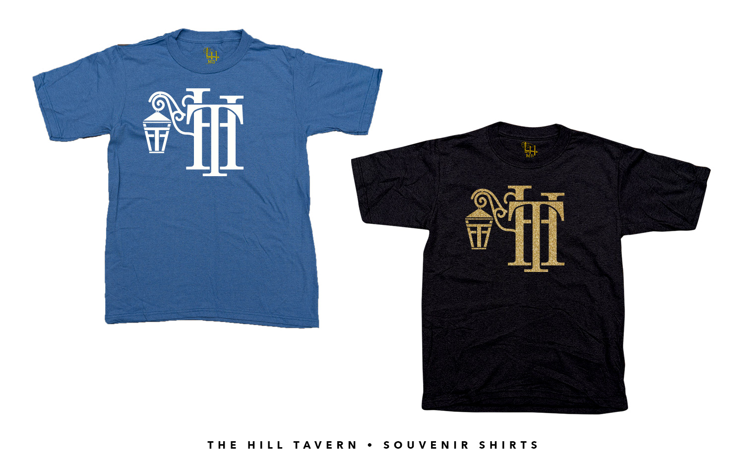
The Hill Tavern job came about from a simple request for staff shirts. That morphed into a full brand overhaul, including a new sign, business cards, and t-shirts. The restaurant sits at the base of historic Beacon Hill in Boston, where you pay about $800 per square foot for 101°F housing. But hey, it's historic.
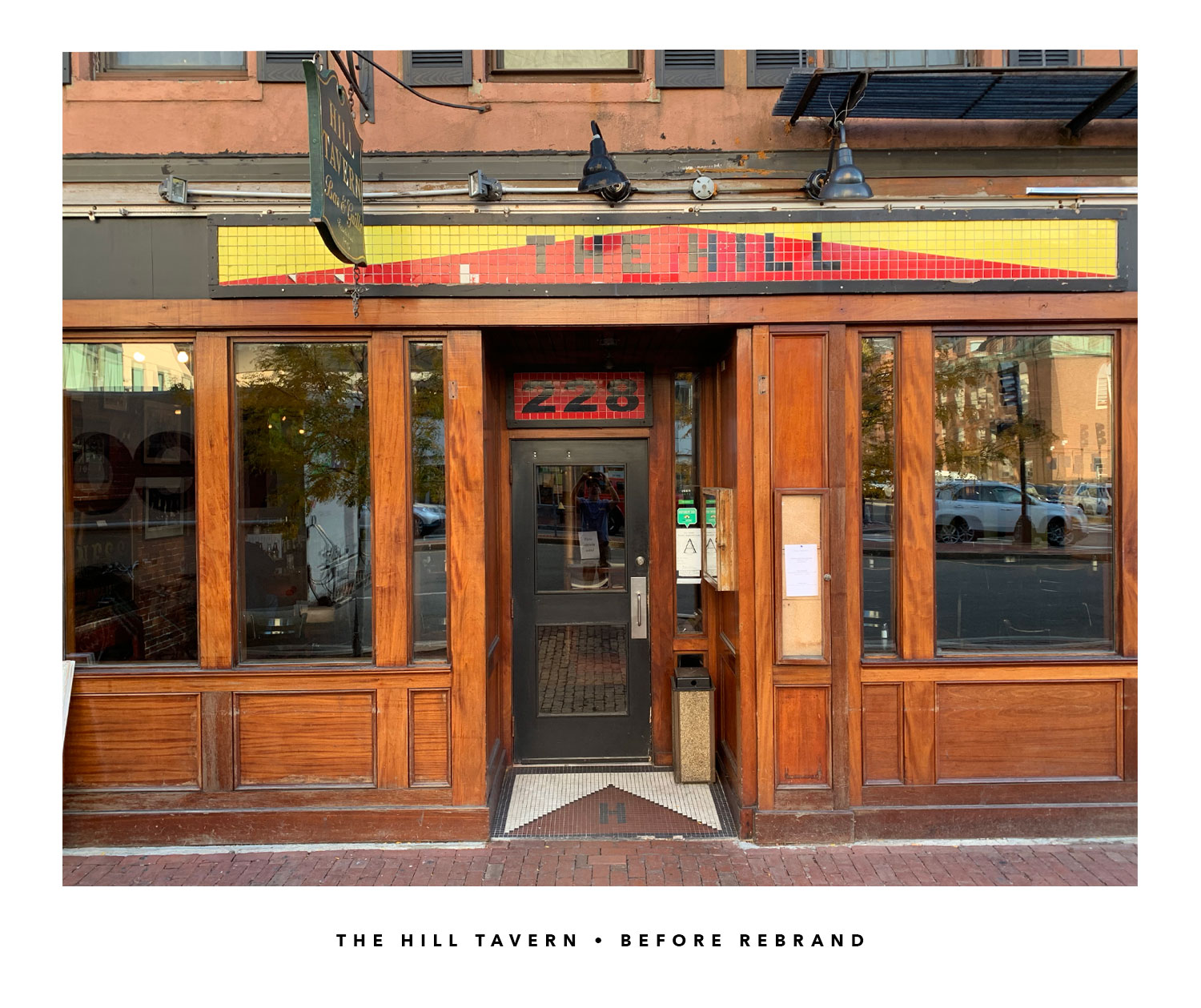
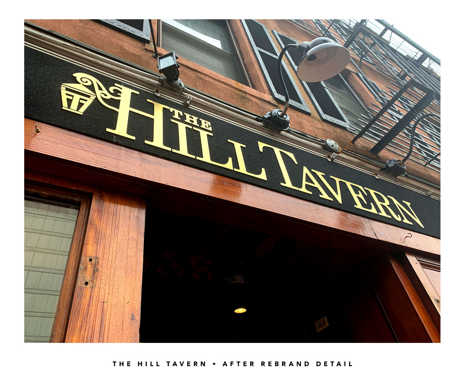
As you can see, the mosaic pyramid wasn't cutting it anymore. The tiles were slowly coming back down to Earth and it was a difficult to read. Let's get a little more contrast and legibility.
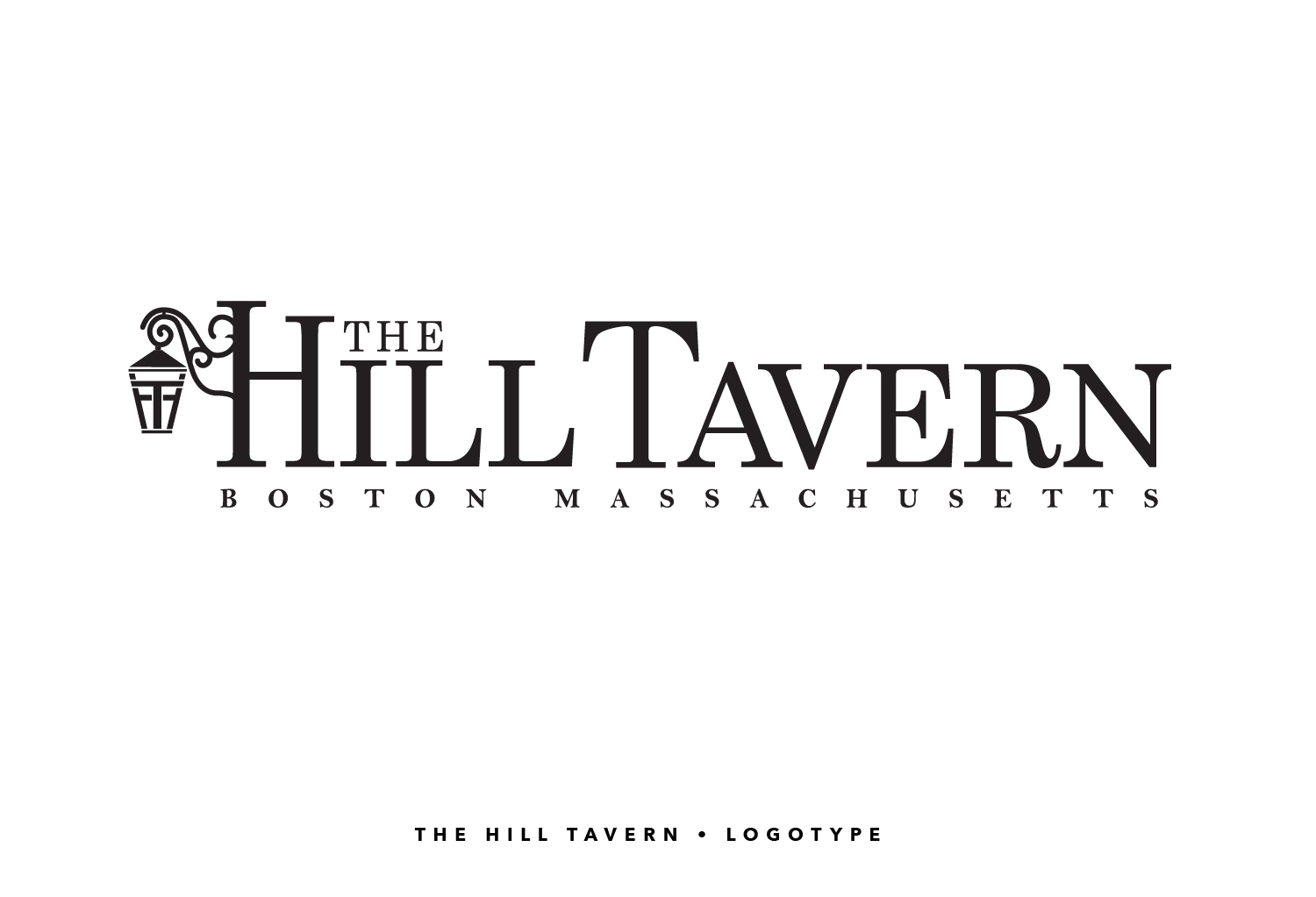
The direction I aimed was historically appealing with just a splash of modern - an old soul logo, if you will. People don't come to Boston to go to the beach or get a slice of pizza. They come to Boston to follow the cow paths that Paul Revere galloped down 250 years ago. I wanted to reflect that sentiment but with a sense of welcome.
The new sign works better with the lighting, can be seen across the street while moving at a Bostonian pace, and reflects the neighborhood's history much more than the previous facade.
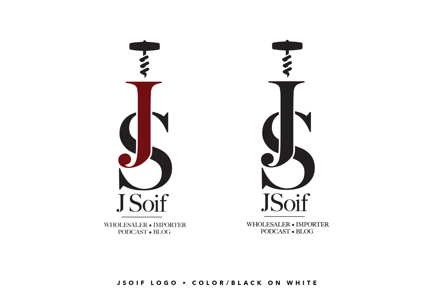
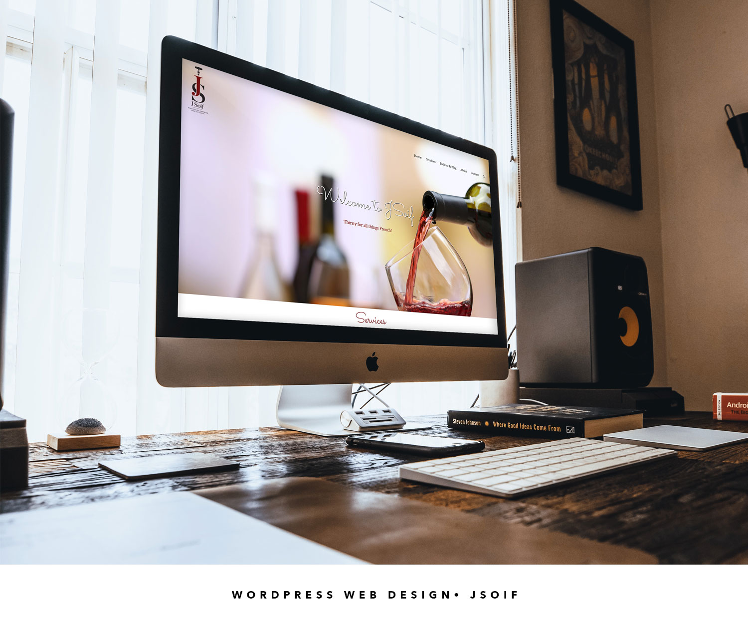
Branding • JSoif
A brand new company in Chicago serving as a wholesaler and importer of wine as well as a travelling podcast in which the owners sit down with industry figures to highlght wineries and restaurants alike.

Branding • Looming Hope
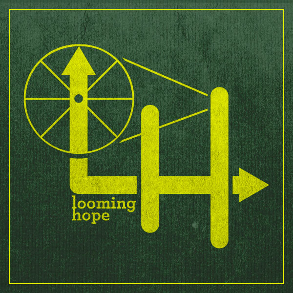
An acquaintance (now good friend and brother from another) had an idea brewing for ten years and had only told one person. I happened to be the third. His idea was to build a sustainable clothing line while also giving back to the environment. Now THAT is something I can get behind. In addition to that I loved the almost oxymoronic sense of something looming (negative connotation) and that thing is hope (positive connotation).
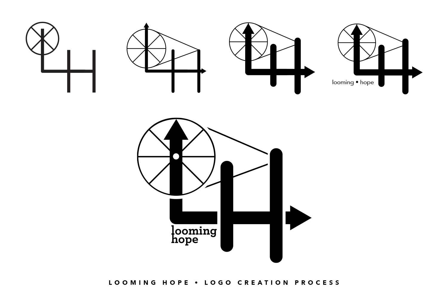
Everything was pretty much in place except...the brand itself. He had valiantly sketched up some mocks on Microsoft Paint and had given me the direction to run in. It incorporated a stylized and simplified loom and played off of the letters L & H. His idea was there. I just had to bring it to life.
The first logo is essentially a jump off point very similar to his since I am missing the original sketch. It will surface on eBay in 25 years, no doubt. Along the way there were additions, subtractions, widening, thinning until finally we had tweaked until we could tweak no more. Thus was born, Looming Hope and I was on the hook for the overall aesthetic. And so far, so good.
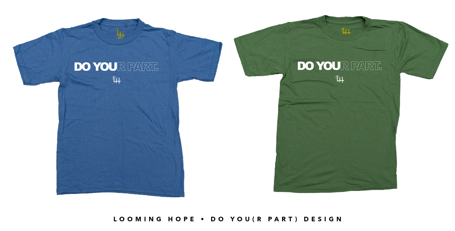
Since 2018, Looming Hope has become quite the little start up company, benefitting the Earth twofold. The shirts are made from 100% recycled materials, not outsourced overseas, and a percentage of each sale, wholesale or retail, will go directly into an environmental support fund used for community cleanups and other local, environmental initiatives. You will see Looming Hope's shirts all over this website, as I have become a proud part owner and I believe in every thread in every shirt. End rants followed by pats on ones' back.

Branding • Revel Earth
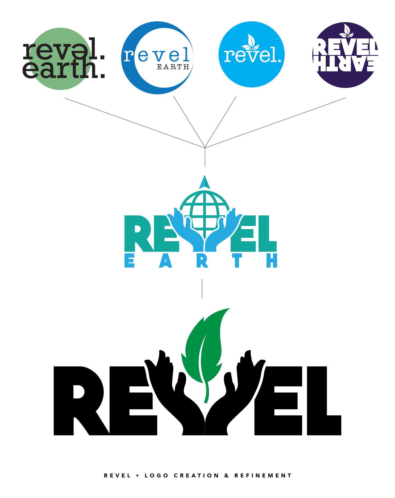
"What is this environmental support fund you speak of," you say? It is a companion company to Looming Hope called Revel Earth. As stated earlier, a percentage of every sale is poured into a fund and when the stars align and the weather permits, The LH/RE crew will be hard at work cleaning up the city's backyard. In order to differentiate the two companies, we needed another logo. I say "we" because now I'm one of the cool kids. Where as there was almost a drawn up blueprint to the Looming Hope logo, with Revel Earth we decided to use the "design until something sticks" method and cherry pick the best elements from each rough draft.
As you can see it began with the obvious Earth shapes and all the typical things you would expect. From there we junked the expected from the original 4 (there were actually 8 but those have long been burned and buried) and landed with the heavy REVEL typeface with the hands holding the Earth. While I liked the direction, there was something far too heavy about it. The text plus the Earth just felt like it weighed a ton. Referring back to the original four sketches, I revisited the leaf and it happened to lighten everything up. In fact, it is one of my prouder moments, not only because of what it stands for, but because I succeeded in making one of the heaviest logotypes in existence feel light by changing just one element.